
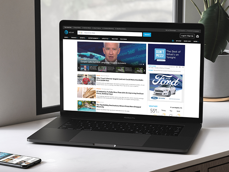
att.net was AT&T's web portal: 45 million+ email users, most of them over 50, and $41M+ a year in ad revenue, with content syndicated from partners like CNN, USA Today, TIME, and Sports Illustrated. As Senior UX Designer I owned the desktop navigation redesign, working to get more people past their inbox and into the content verticals that paid the bills.
+25% lift in nav dropdown engagement
Validated through multi-round live A/B testing on the real portal, not a lab study.
45M+ users served by the redesign
The new navigation shipped across one of the largest news portals in the US.
$41M+ in annual ad revenue on the line
Every navigation change directly affected an ad-funded business at scale.
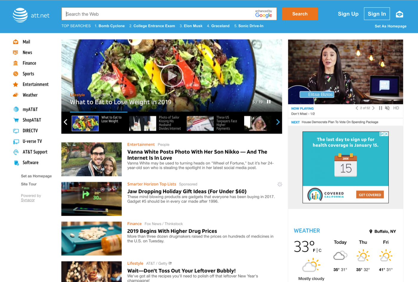
Most users checked email, skimmed a few homepage stories, and left, and the content verticals that carried the ad revenue were effectively hidden behind a click and a page reload:
The portal redesign wasn't the only AT&T surface on my plate. I ran it at the same time as a second product, with two codebases, overlapping stakeholders, and concurrent timelines:
Holding both meant keeping patterns consistent where it helped users and deliberately diverging where the platforms demanded it, while staying legible to two engineering teams at once.

Four separate inputs all pointed the same direction:
Nearly every major news site used the pattern, and it had already proven itself inside AT&T's own ecosystem. On mobile, a horizontal nav redesign I led earlier had lifted:
The mobile precedent that built the business case for bringing horizontal nav to desktop.
I researched navigation best practices (7–9 top-level items is the comfortable ceiling) and worked with AT&T to consolidate a sprawl of links into a dropdown, keeping the focus on the core content verticals.


Rather than plain subcategory lists, I explored editor-curated content cards inside each dropdown, so hovering a category previewed the vertical's actual stories instead of just naming them. The bet was that showing the content, not just labeling it, would pull more users in.
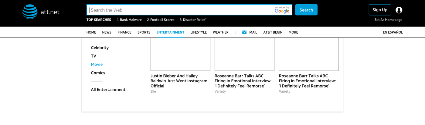
We ran the redesign as live experiments through Adobe Test & Target against 10% of users. It took two rounds, and the first round picked apart an assumption:
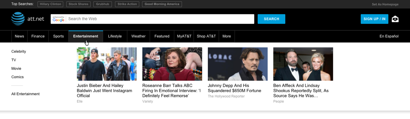
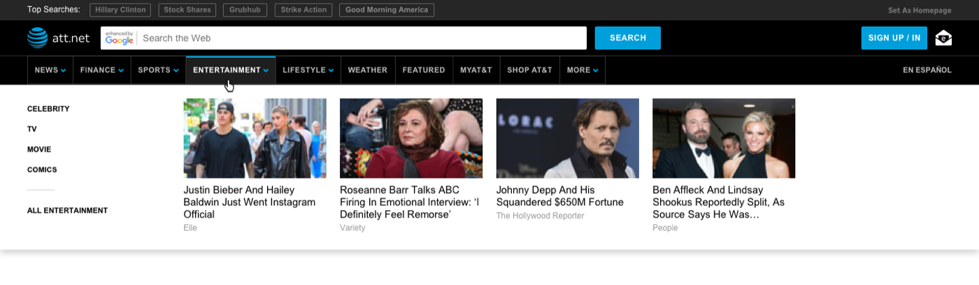
I also validated the direction with the actual audience, testing with the 50+ demographic through UserTesting. They overwhelmingly preferred the horizontal nav and singled out the content cards as a helpful way to find related stories.
The data didn't just pick a layout. It kept picking apart my assumptions until the design earned its lift.
The shipped design separated content navigation from the AT&T-properties area, a split users found much clearer and one that finally resolved the too-many-items problem the org had struggled to prioritize down on its own. The horizontal content nav made the revenue-driving verticals visible without a reload, and the A/B-validated affordances drove the 25% lift in dropdown engagement.