AT&T Live Video Optimizations
Android App
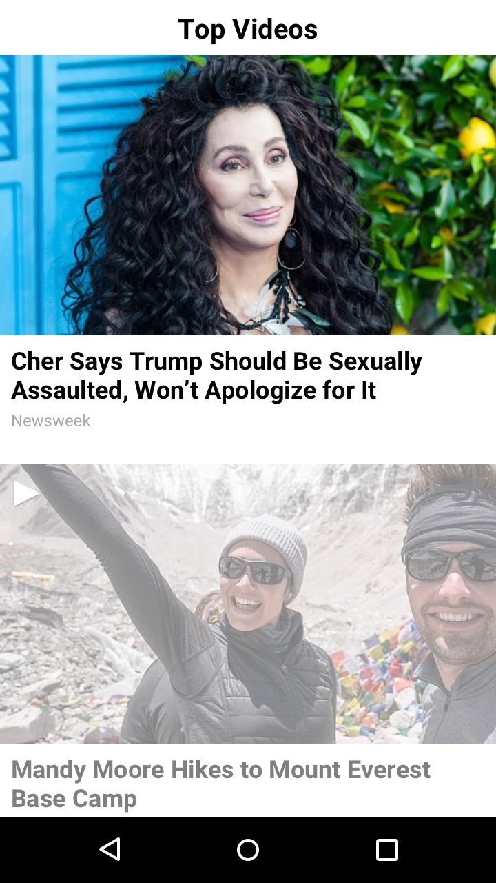
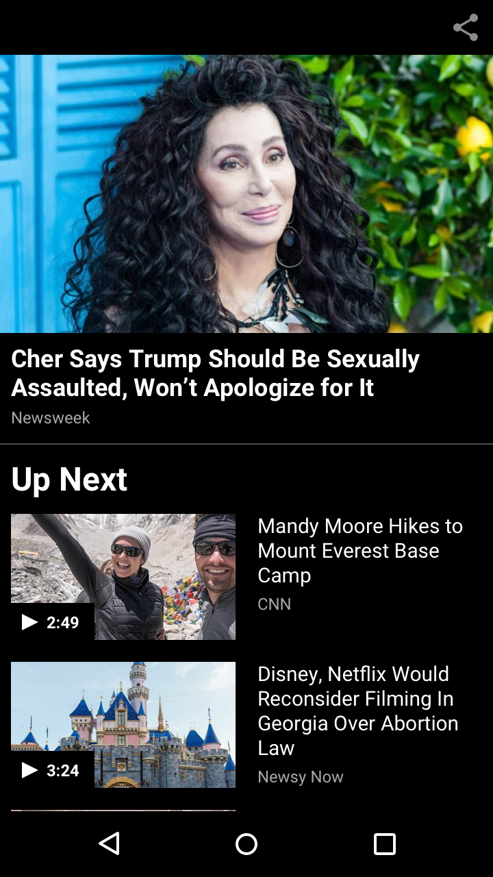
The AT&T Live App was a way for users to connect to their att.net email as well as to read up on the latest news, watch trending videos, and discover featured content. For this project, we were tasked by the AT&T product team to increase engagement with videos. The original video experience was a standard player that would simply play the video you selected to watch. It would automatically launch in a wide screen modal and end with a black screen once the video was done playing. A user would have to click the back button in order to go back to the article or stream card they originally clicked on. There was no user path to guide the user to more videos they might be interested in. The original experience provided a dead end, so we had to come up with a solution to help users discover more videos.
Competitive Research & Exploration
I researched comparable news or video apps like Apple News, CNN, NBC News, NYTimes, YouTube, and so on, to get an idea of how others handled video content. Some of these apps had simple video players with no further video suggestions like we did, and some featured a playlist of some sort to encourage users to watch more videos. I took inspiration from a few of these apps to wireframe some initial ideas.
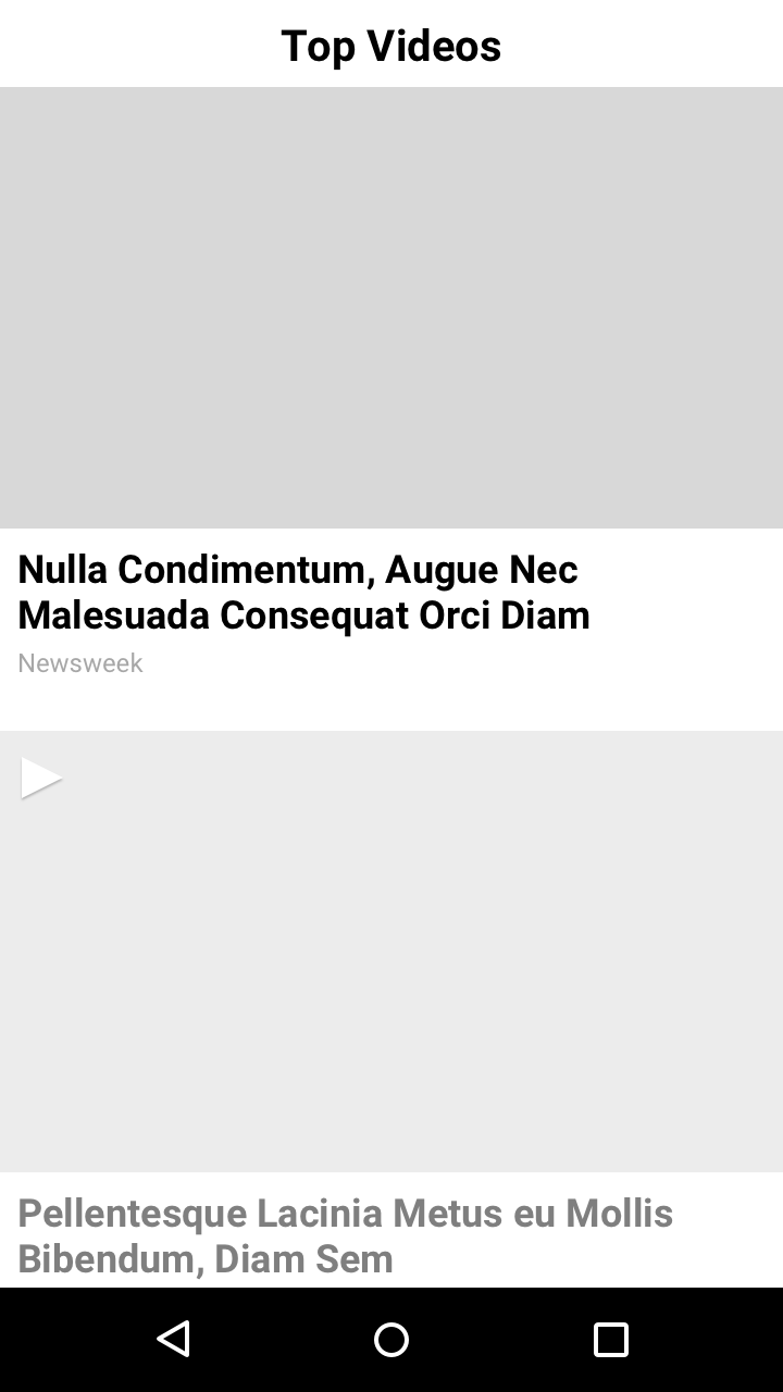
WIREFRAME V1
WIREFRAME V2
Refinements
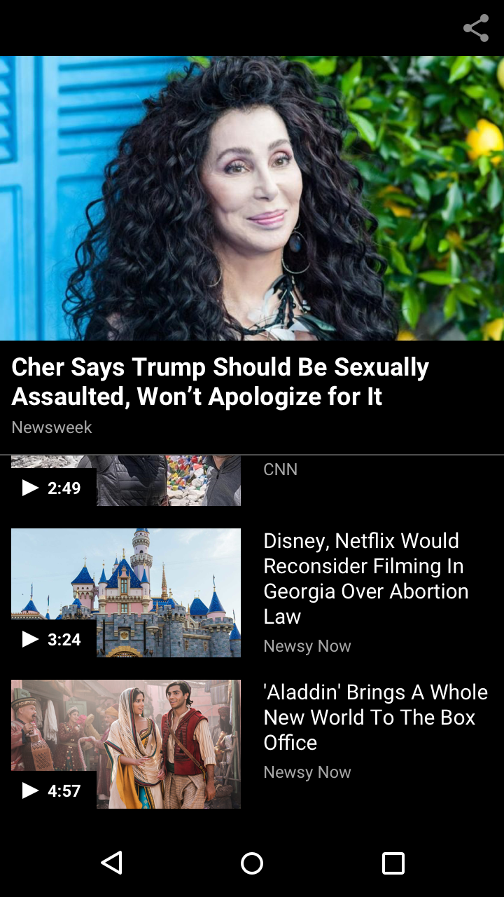
Once I had 2 general ideas of encouraging users to watch more videos, I refined the wireframes into high fidelity mocks and thought through the functionality of the experience and ways the user would interact with a video playlist. Another playlist layout I explored was a horizontally scrollable playlist below the video like we do on our mobile web portal, but I cancelled out this option because users were already used to using swipe left and right gestures to navigate to the previous and next screens.
V1 LIGHT
V1 LIGHT - SCROLL STATE
V1 DARK - SCROLL STATE
V2 LIGHT
V2 DARK
V2 DARK - SCROLL STATE
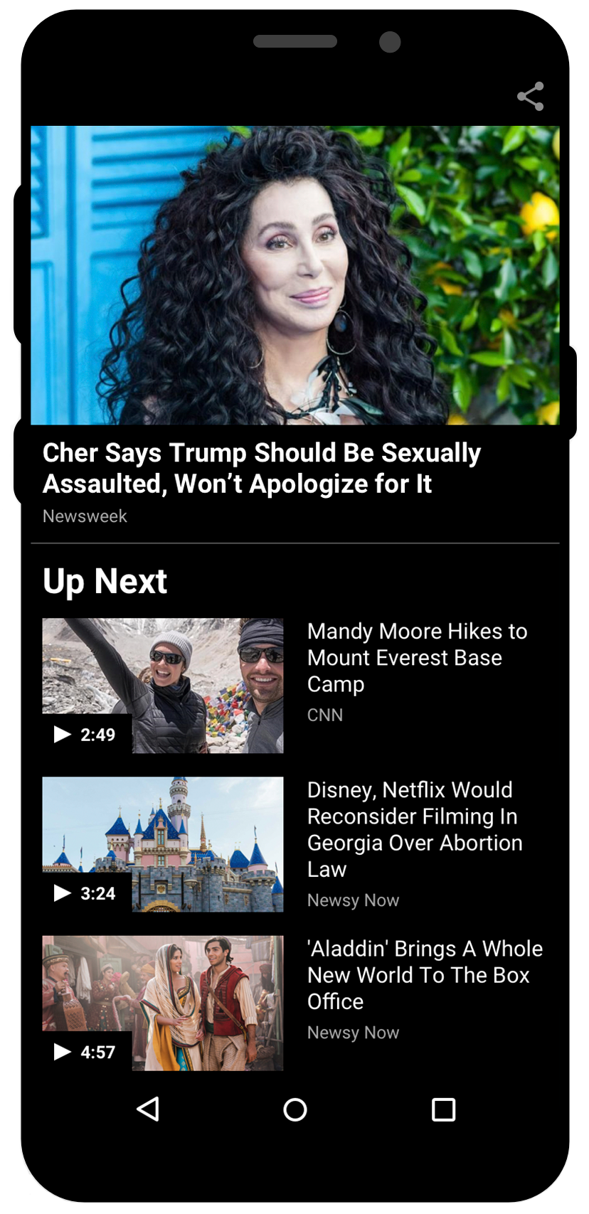
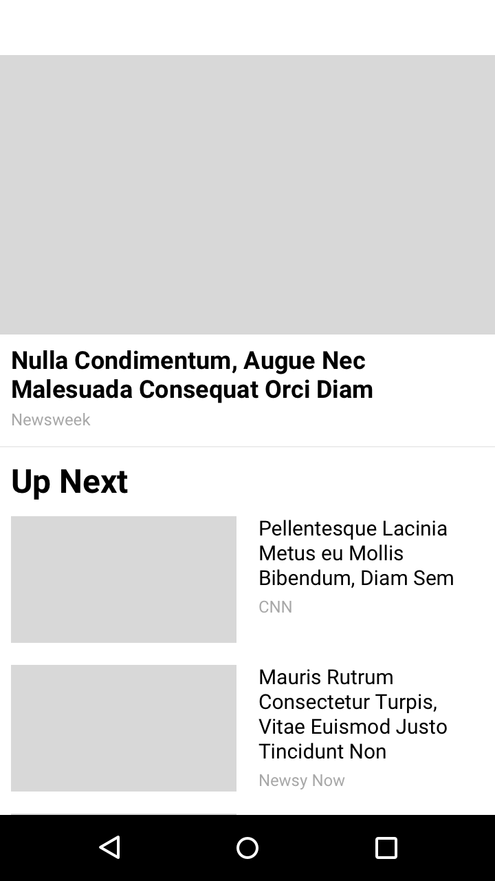
Final Design
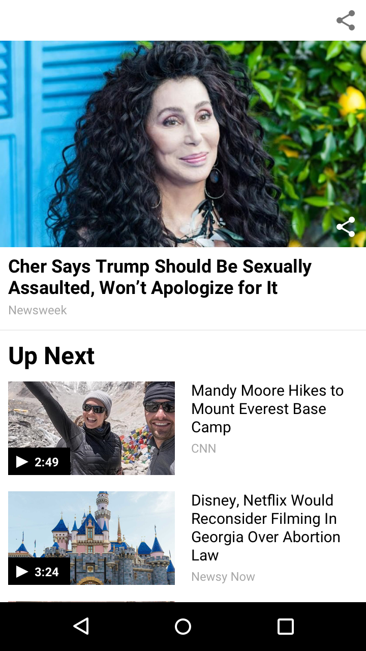
After exploring and iterating on the different options and looking into possible functionalities, we came back to the goal of the feature to help us make a decision on which route to take. Since the main goal was to lead users to more videos they might be interested in, we decided that it was best to move forward with the V2 experience because a user is able to see a higher number of videos a lot more quickly considering the size of the thumbnails. This version also lets the actively playing video remain in focus at the top while the user scrolls to see if another video in the playlist piques their interest. The V1 experience on the otherhand lets the playlist be the focus once the user starts to scroll because the actively playing video minimizes to the bottom of the screen and a user is able to view full width cards of other potential videos to watch. To validate our hypothesis, we conducted a user test and V2 was our clear winner.