Wyndham Hotels & Resorts | Rooms & Rates
Global Hospitality & Loyalty Platform
Wyndham’s Rooms & Rates experience is a critical step in the booking flow, where users compare room types and pricing before finalizing their reservation. Users consistently struggled with room comparison due to inconsistent pricing structures, dense content, and unclear hierarchy. At the same time, previous redesign efforts often improved usability but negatively impacted conversion, leading to increasingly cautious iteration over time.
As part of Wyndham’s broader replatforming initiative, I led the redesign of the experience with a focus on simplifying decision-making, improving comparison, and creating a more scalable foundation for future iteration across a complex franchise ecosystem.
Role & Objectives
Lead UI/UX Designer for Wyndham’s Rooms & Rates experience across responsive web platforms, working closely with product, engineering, and research teams as part of a broader replatforming initiative across Wyndham’s digital ecosystem.
The replatforming effort created an opportunity to revisit recurring usability issues, rethink how users compared rooms and rates, and establish a stronger foundation for future iteration.
Key Objectives:
- Improve comparison: Help users evaluate room types and rates more easily
- Clarify pricing: Create clearer hierarchy and rate differentiation
- Reduce cognitive load: Simplify decision-making at a high-intent step
- Design for scalability: Support for franchise-driven content variability
Original Experience Analysis
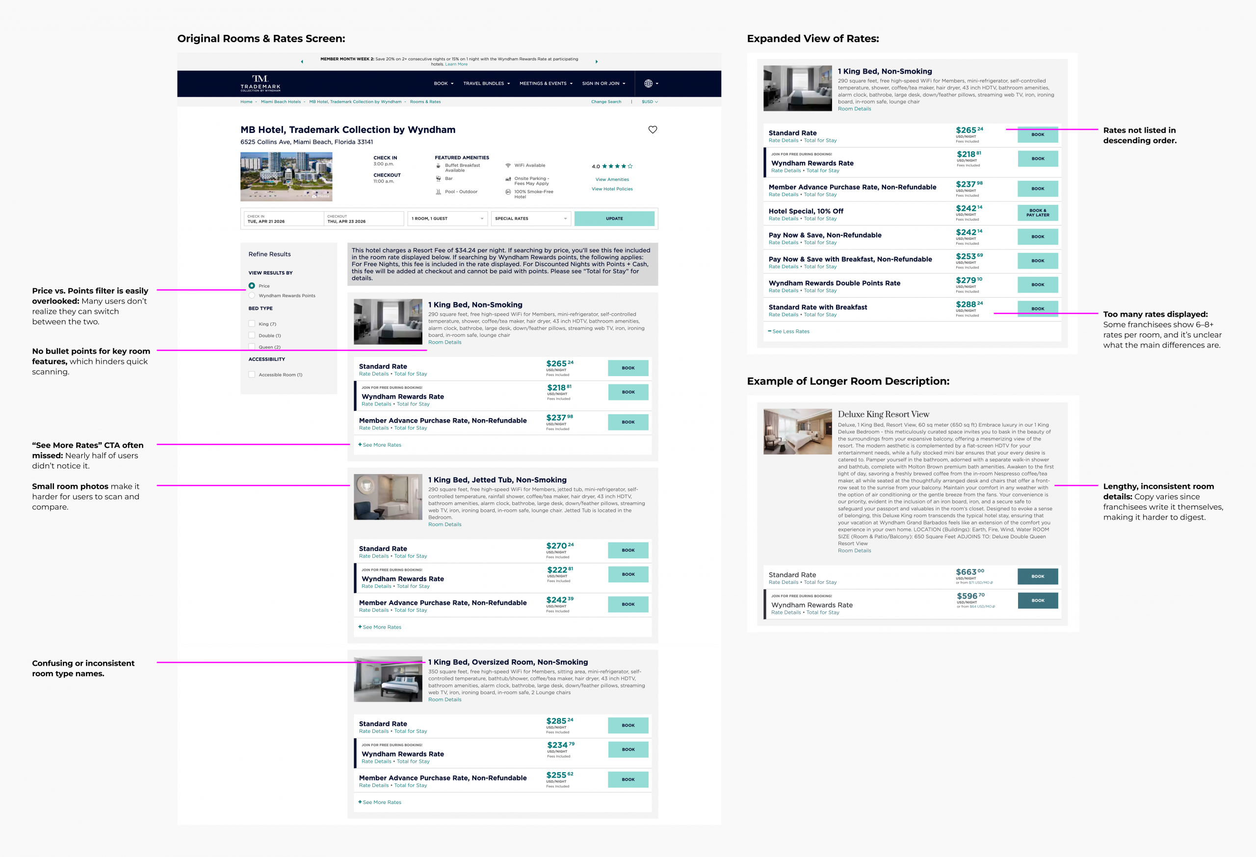
Challenges & Constraints
Wyndham’s Rooms & Rates experience exists within a large franchise system, which means room details, pricing, and content can vary a lot from property to property, because franchisees own the content.
Key challenges included:
- Long or inconsistent room descriptions and amenities across properties
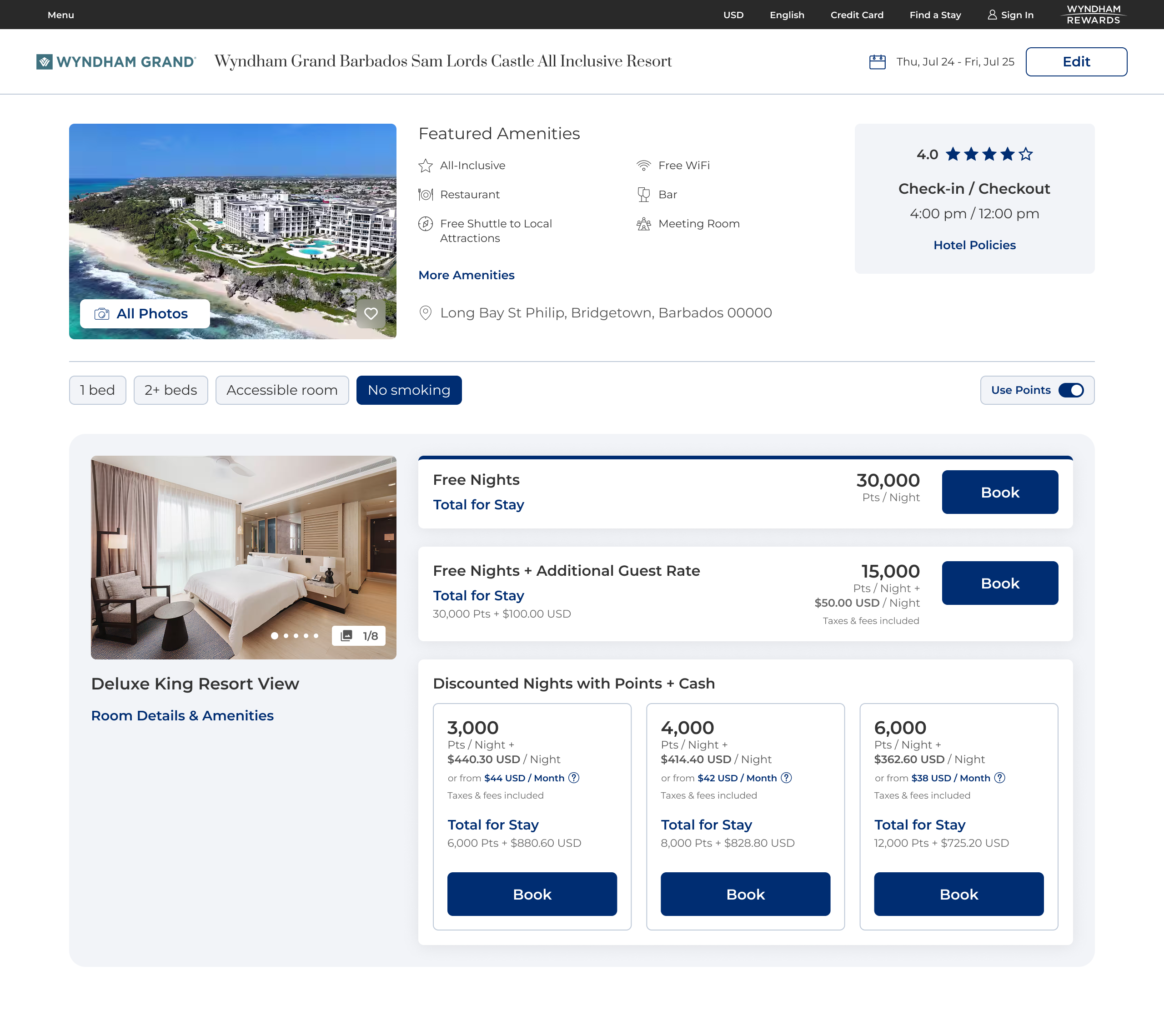
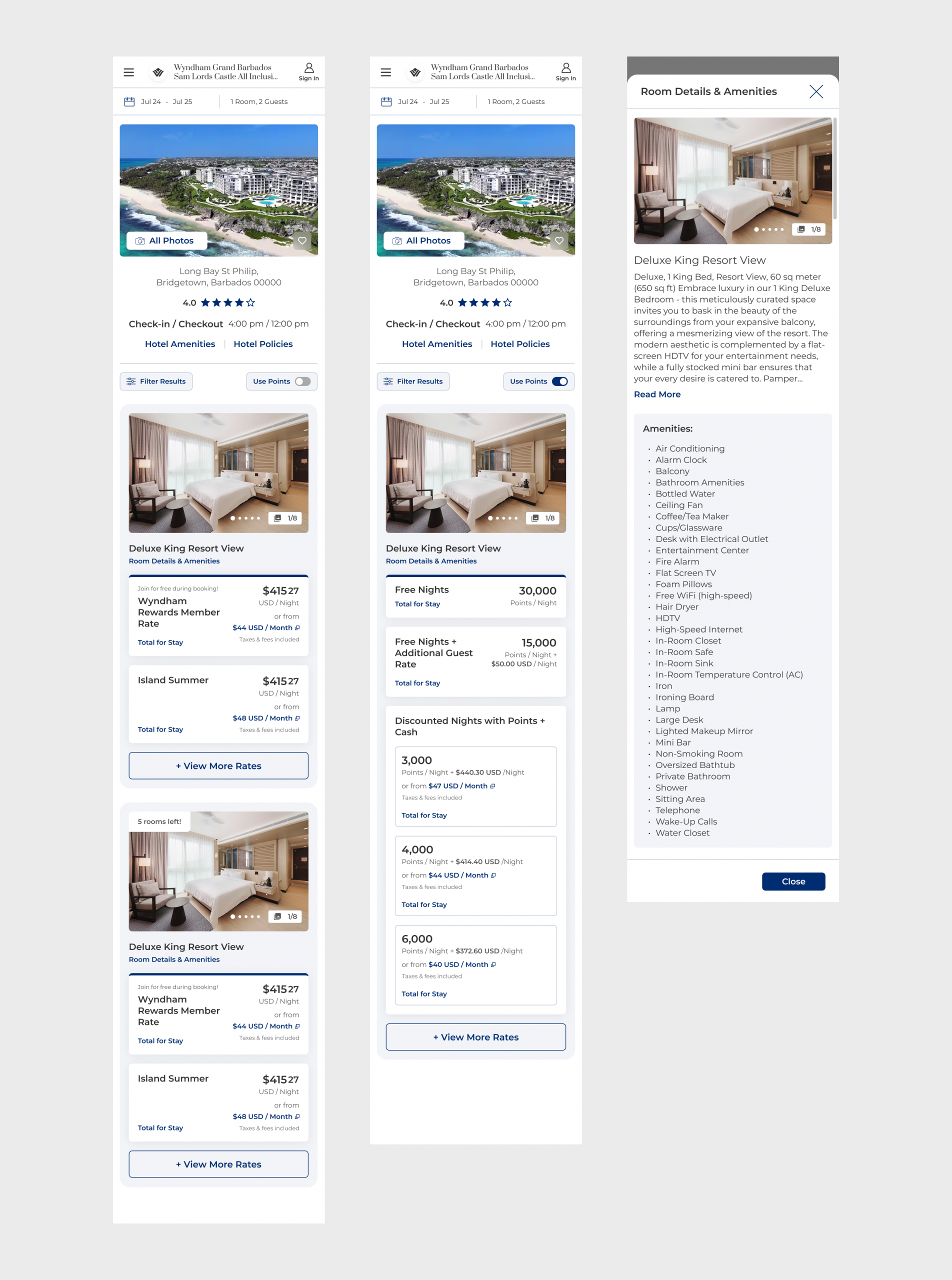
- High number of rate options per room, with some rooms offering 5+ choices despite users indicating 3–4 is the maximum comfortable range.
- Lack of standardized naming conventions for both rooms and rates, resulting in inconsistent or redundant naming conventions (e.g., repetitive “non-smoking” labels for all rooms when the entire hotel is non-smoking).
- Unclear differentiation between rate types made users struggle to understand meaningful differences between rate options, especially around perks and inclusions.
These inconsistencies increased friction at a critical decision point in the booking flow and created challenges that extended beyond visual redesign alone.
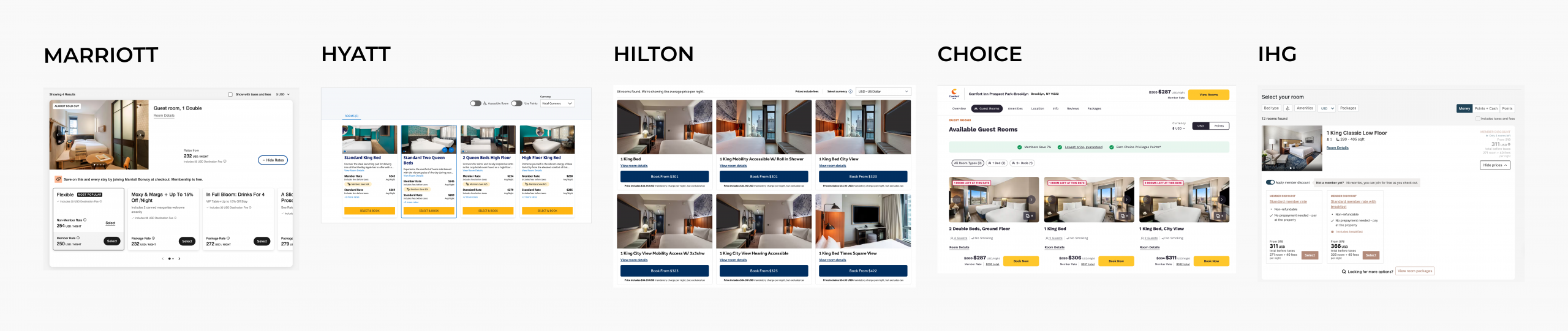
Benchmarking & Flow Exploration
We reviewed past usability testing and benchmarked major hotel and travel platforms to understand common patterns in room and rate selection.
Across the landscape, we identified two dominant approaches:
- Single-page comparison models, where users browse room types and rate summaries within a unified view (e.g., Marriott, Hilton, Hyatt, IHG)
- Separated room and rate flows, which provide deeper pricing detail but introduce additional navigation steps (e.g., Choice and patterns commonly used by online travel agencies (OTAs) such as Expedia and Booking.com)
We focused our immediate solution on improving clarity within a single-step experience.
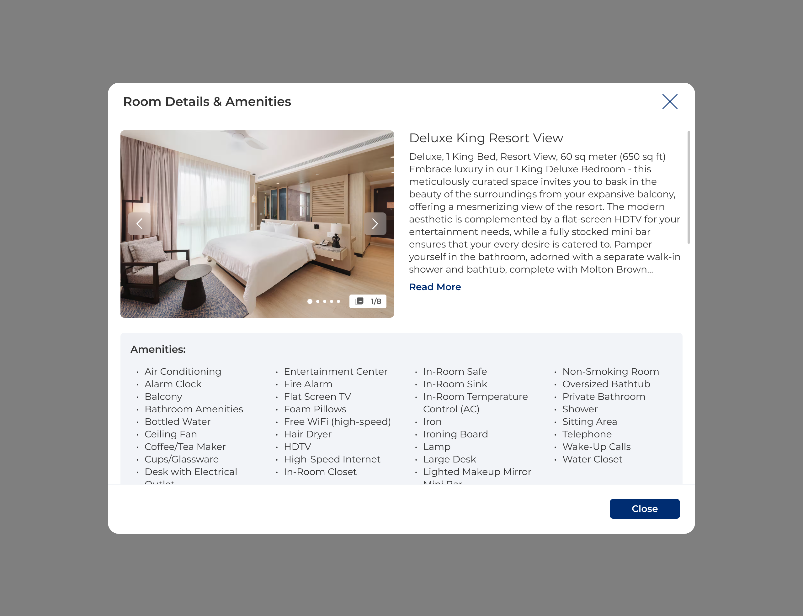
As part of longer-term exploration, we also considered more progressive patterns (such as modal-based rate expansion) as a potential future iteration to further deepen rate transparency without introducing additional steps.
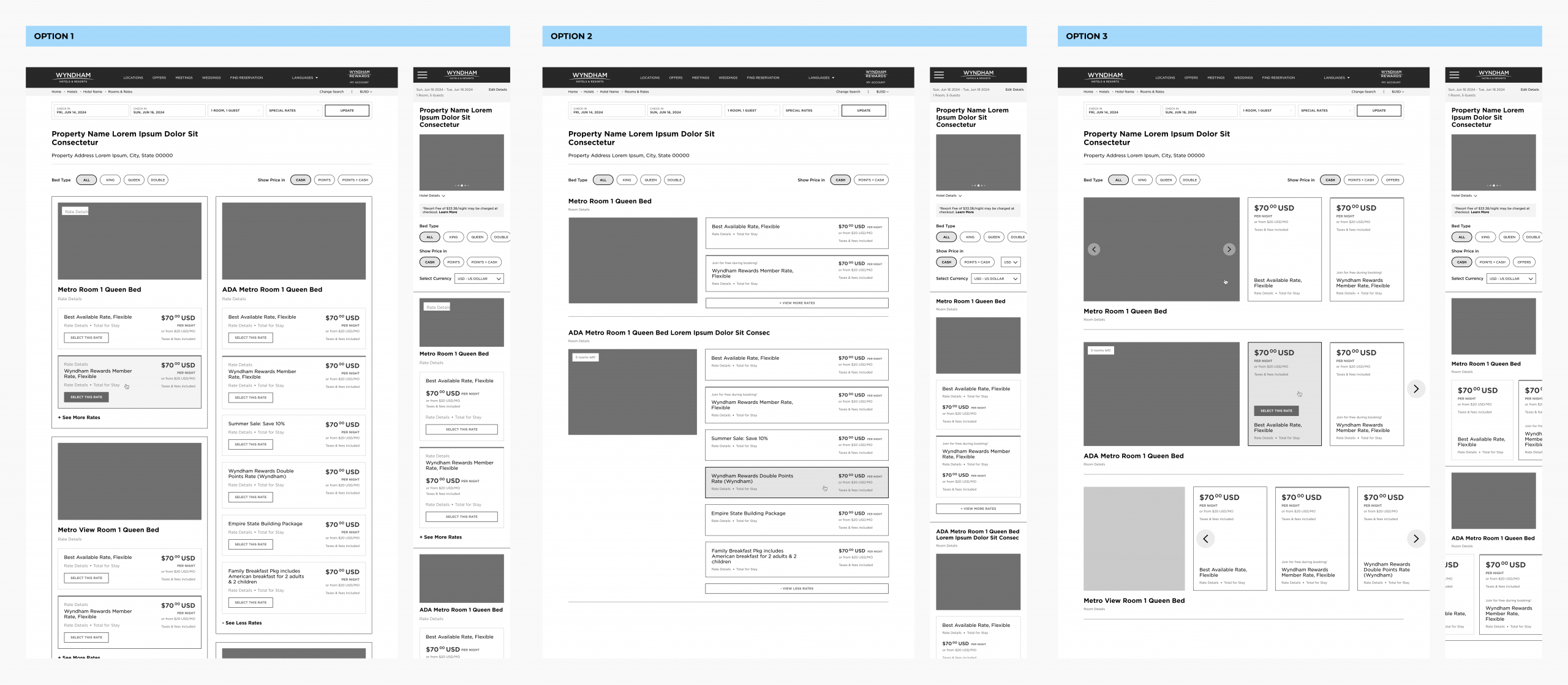
Design Directions
Based on testing insights, we focused on several key directions to reduce decision fatigue and improve clarity in the Rooms & Rates experience.
We focused on:
- Limit number of visible rate options per room
- Improving scanability through larger images and simpler hierarchy
- Clarifying rate differentiation and improving visibility of key interactions
- Exploring alternative interaction patterns (including modals and layout variations) to support scalability
Validation & Insights
We explored multiple layout directions and incorporated updated design system components as part of the broader Wyndham replatform.
After stakeholder alignment, we moved forward with an incremental approach—refining the existing list-based layout while deferring more experimental patterns for post-launch validation. This decision was largely influenced by the conversion sensitivity of the booking flow and the risks associated with larger interaction changes.
We then conducted usability testing (UserTesting) comparing the updated experience against the current production version across desktop and mobile prototypes.
Overall, users responded positively to the updated design, noting improved visual clarity, stronger imagery, and easier navigation. However, key usability gaps remained:
- Room comparison challenges: Users still struggled to compare rooms due to inconsistent naming and the need to open individual detail views.
- Rate clarity issues: Vague or insufficiently differentiated rate titles made it difficult to understand what was included, increasing cognitive load during decision-making.
- Low discoverability of points toggle: A significant portion of users did not notice or understand how to switch to “Use Points” view.
While the redesign improved overall perception, findings highlighted remaining opportunities to strengthen comparison and rate clarity.
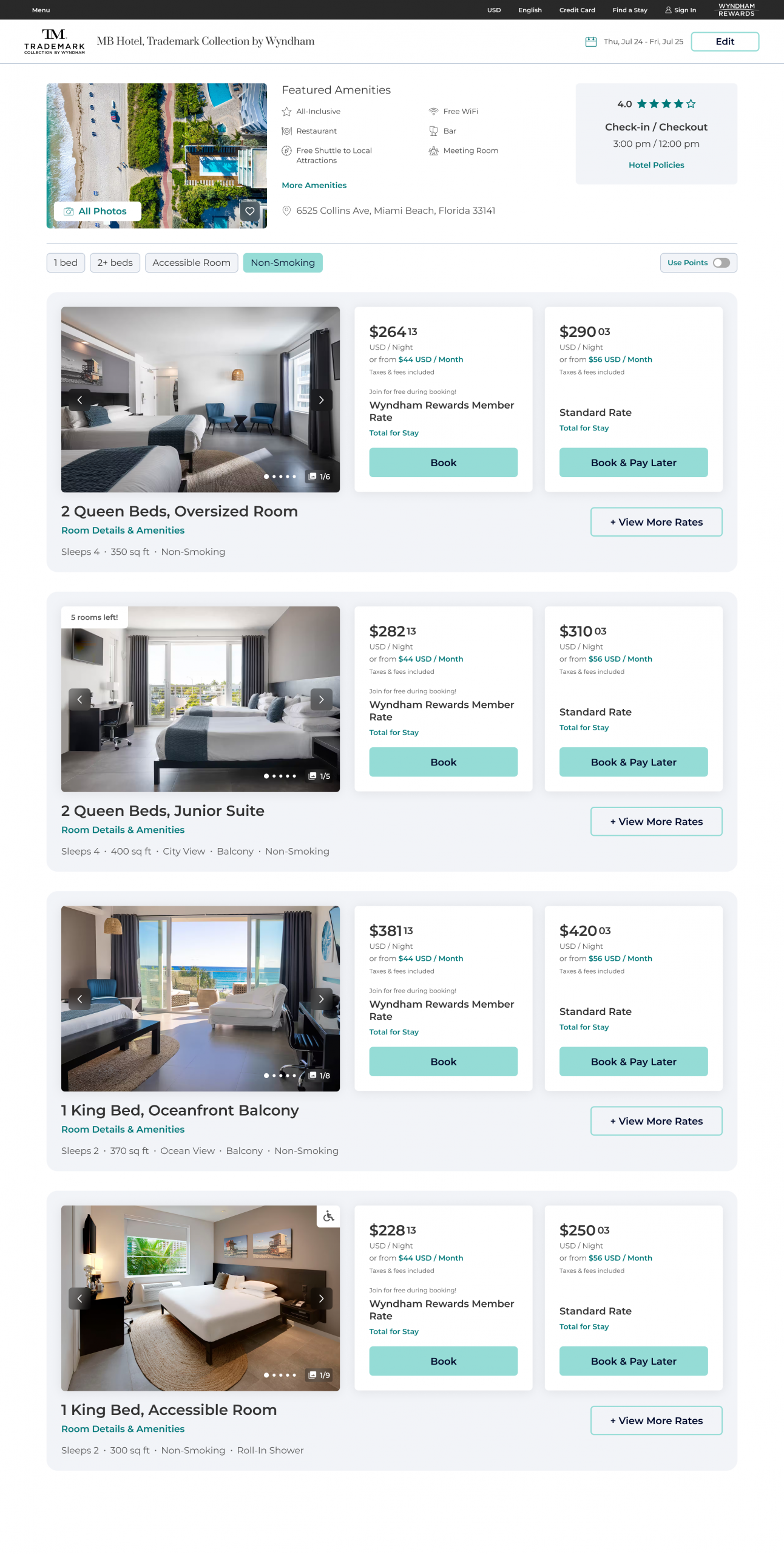
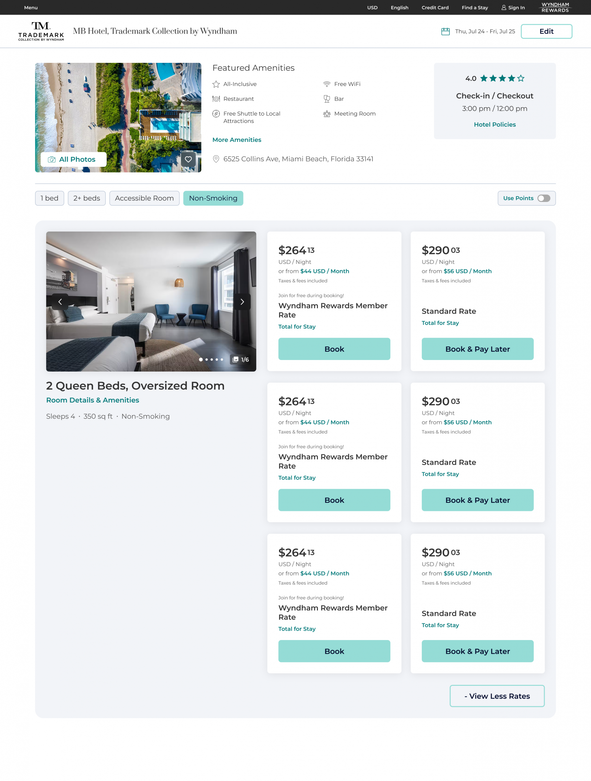
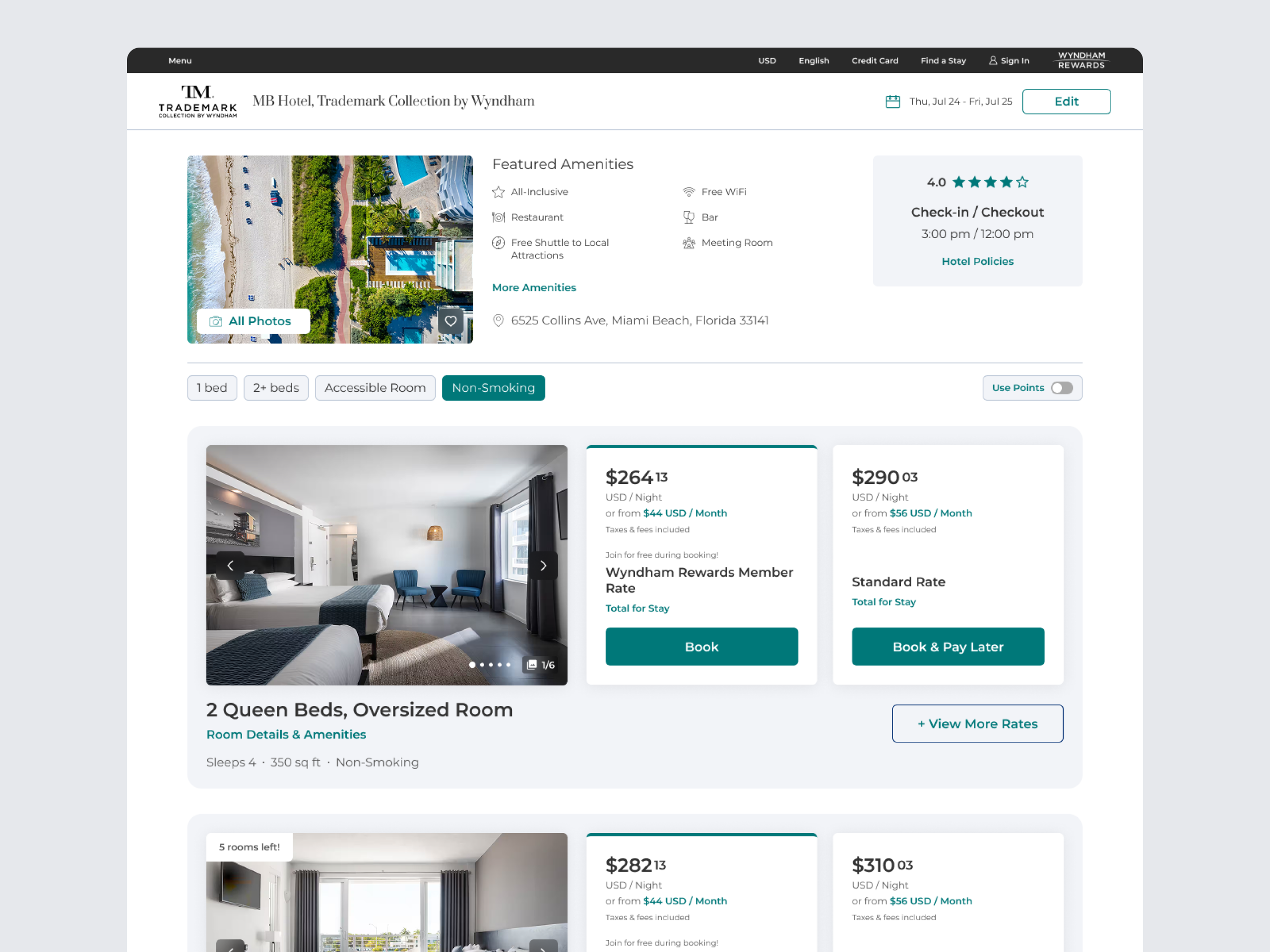
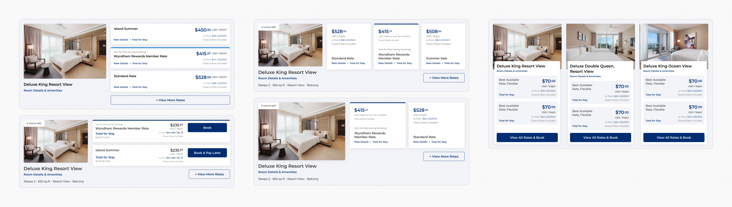
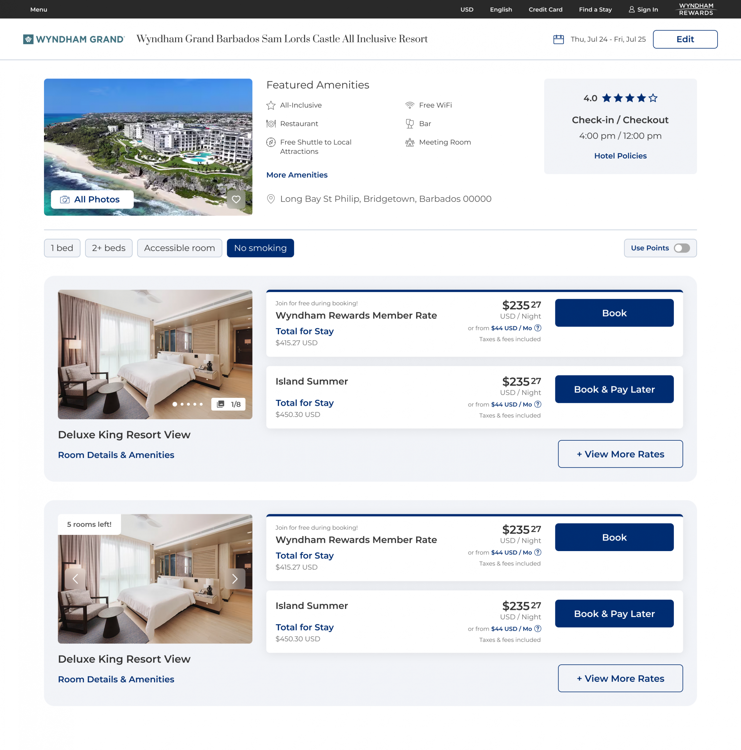
New Desktop Designs (Price + Points + Modal Views)
New Mobile Designs (Price + Points + Modal Views)
Post-Launch Strategy & Future Opportunities
Given the scale and operational complexity of Wyndham’s franchise-driven ecosystem, the team moved forward with the most stable and validated version of the experience at launch, while deferring more significant interaction changes for phased iteration and future testing.
Near-Term Improvements (Post-Launch “Quick Wins”)
- Anchor filters and Price/Points toggle for easier access
- Add concise rate descriptions to improve scanability
Medium-Term Enhancements (A/B Test Candidates)
- Surface key room attributes (e.g., occupancy, square footage, amenities)
- Test richer rate context such as cancellation policies and included perks
Long-Term System Opportunities
- Standardize room and rate naming across franchise properties
- Introduce a side-by-side comparison tool to support higher-confidence decisions
Success Metrics
While post-launch metrics are not yet available, success will be measured against maintaining baseline booking performance while improving conversion, decision confidence, and rate selection efficiency.
Designs for Future Tests