Medly | Prescription Checkout & Delivery
B2C Rx Management
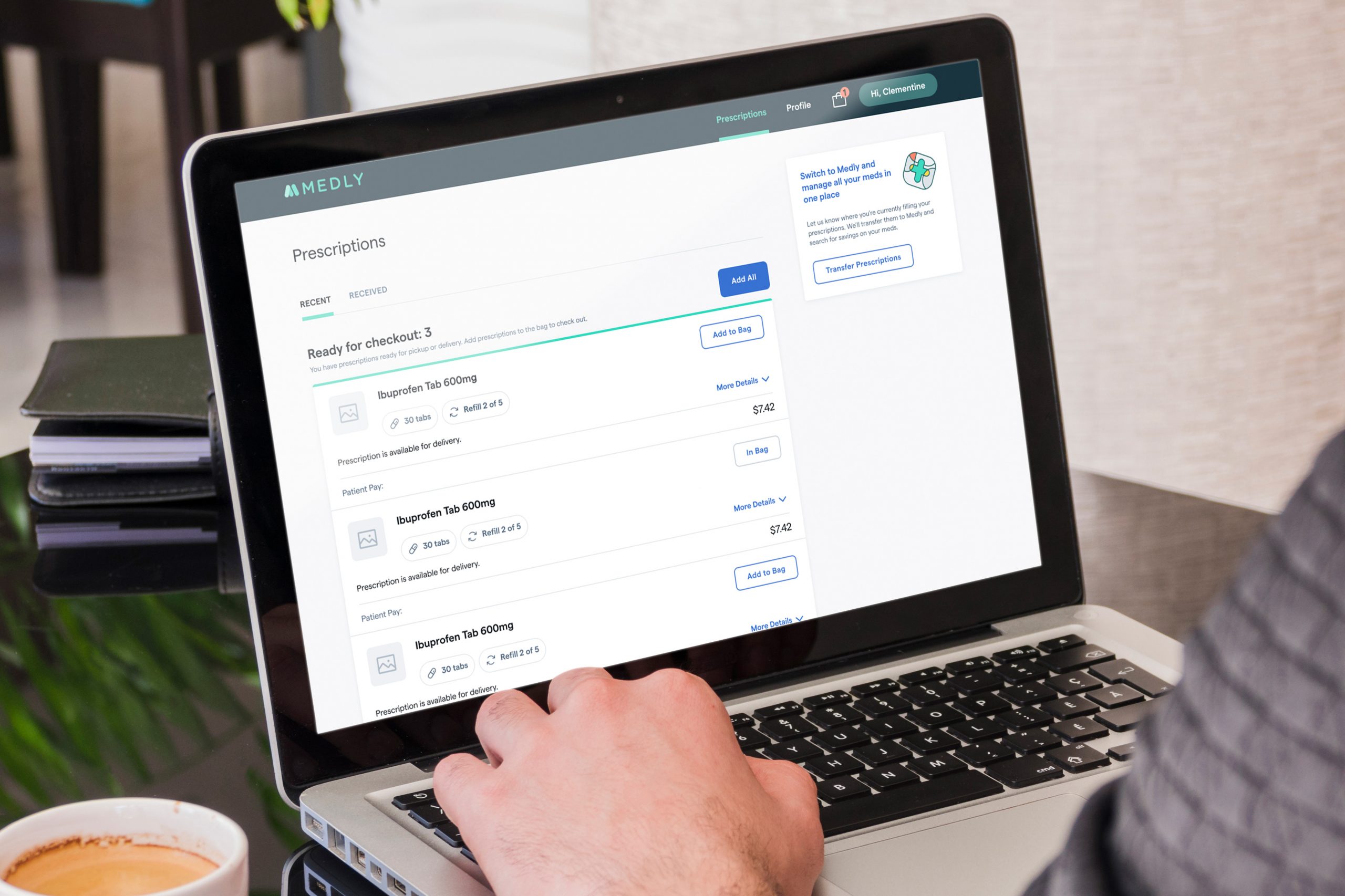
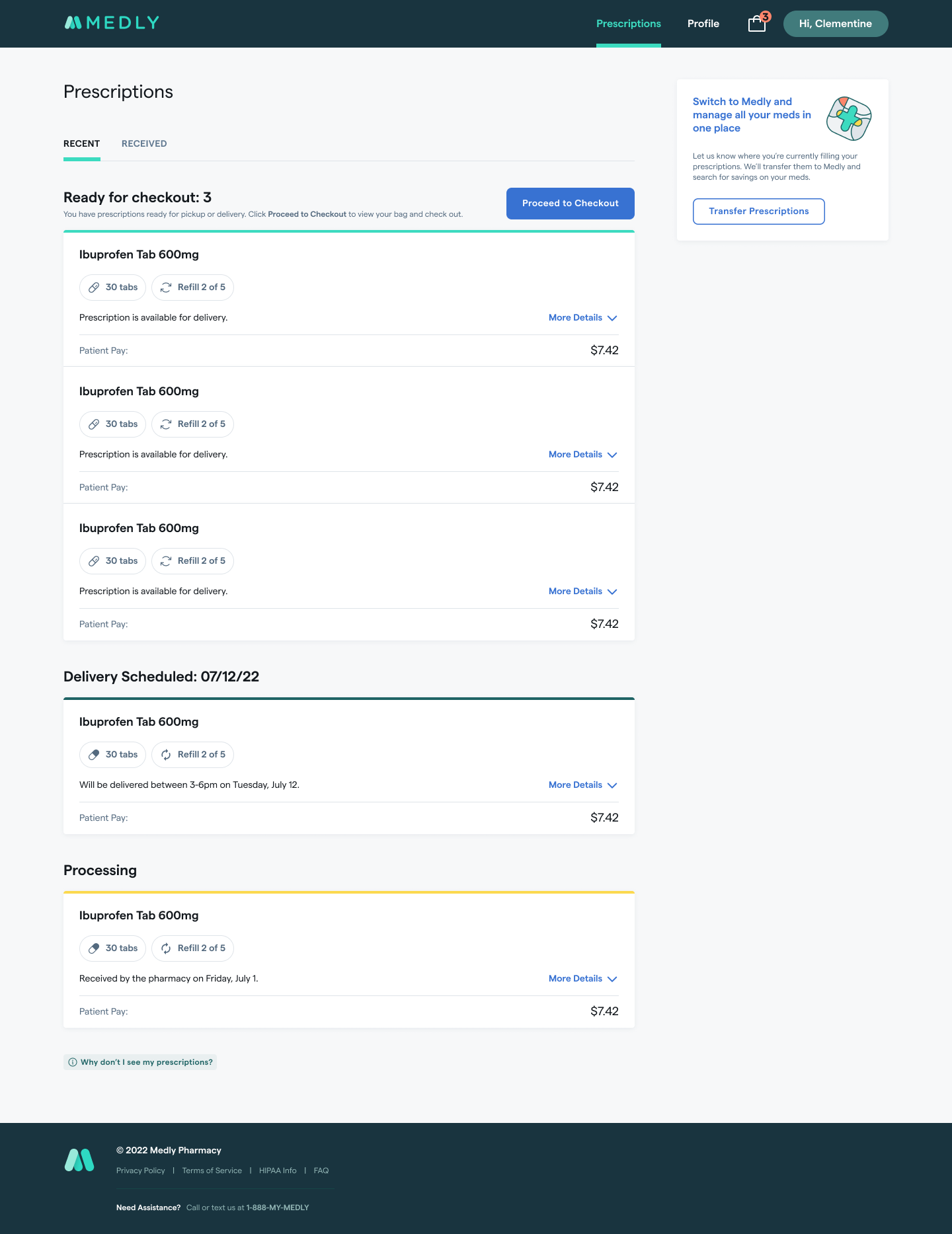
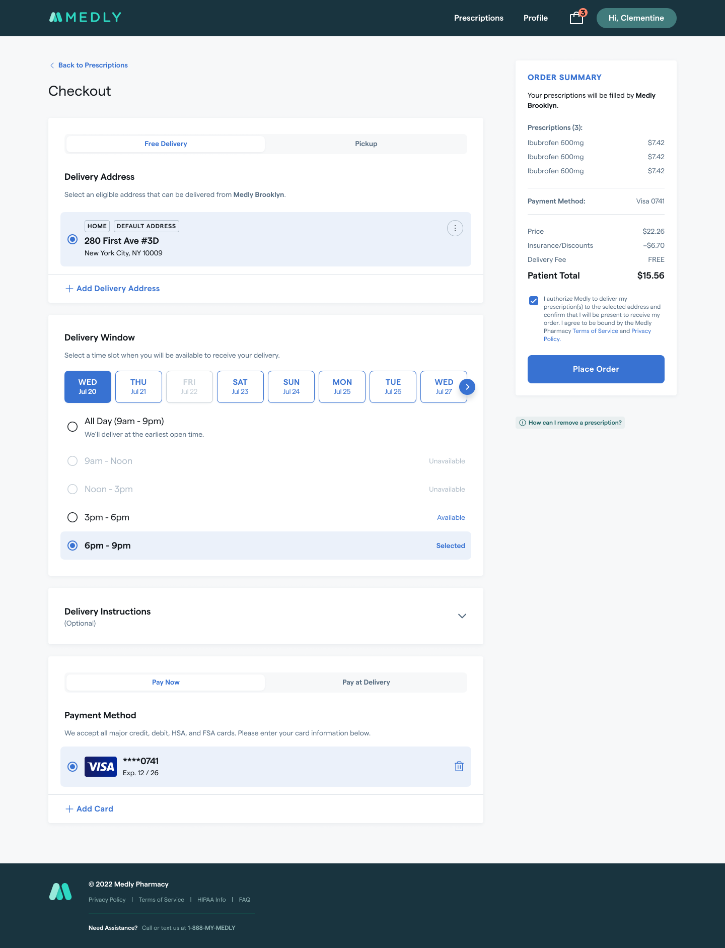
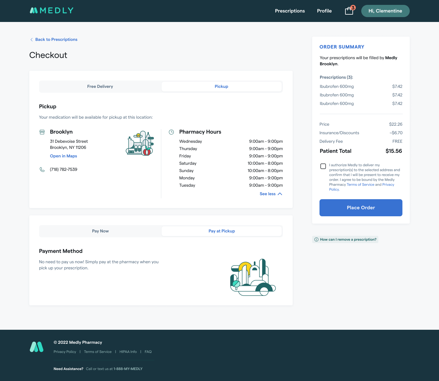
Medly is a digital pharmacy start-up that offers free and fast delivery of medications and easy prescription management. The goal of this project was to create a seamless checkout process so that patients would be able to easily see what prescriptions are available to them, pay for the ones they want and need, and schedule a free delivery. This would also relieve patient experience agents from having to schedule manually for each patient.
Goals & Objectives
- Help patients choose the prescriptions they want to check out.
- Give patients the ease and flexibility to schedule a time of delivery that is convenient for them, but still give them the option to pick up at their closest pharmacy.
- Free up time for patient experience agents to focus more on helping patients with issues outside of manually scheduling prescription deliveries.
- Schedule more deliveries effectively and efficiently.
Pain Points
- Patients had no way of referencing what prescriptions they had with us themselves.
- Patients were only able to schedule deliveries by talking to patient experience agents over the phone every time they needed a medication delivered.
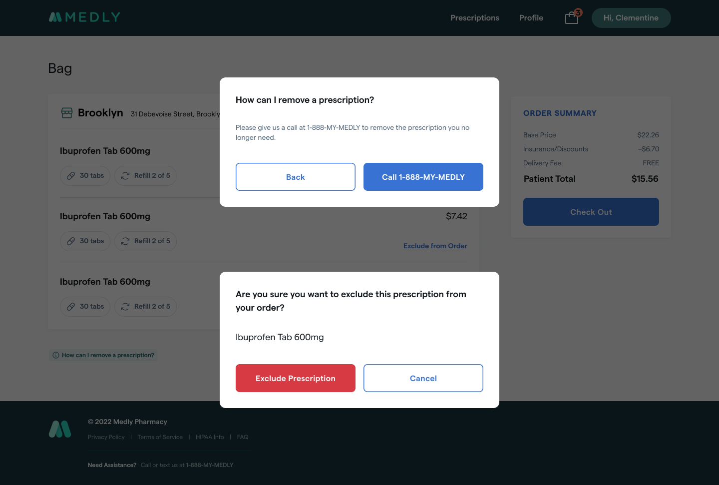
- They also had to speak to an agent in order to take out a prescription from their order that they no longer needed.
Role, Collaborations, & Timeline
- My Role: Lead Designer on the B2C web application team. There were 8-10 total product designers in the company with 1-2 designers dedicated to a product team.
- Cross-Functional Partners:
- Product Manager: Brainstormed features, scoped out what was needed for MVP, and prepared engineering tickets.
- Engineering Lead + Team: Discussed feasibility with lead and how to iterate over time.
- iOS Team: Collaborated regularly with iOS team and their designers to align features.
- Compliance Manager: Met with compliance to make sure we were abiding by pharmacy regulations in the new experiences.
- Director of Clinical Relations
- Patients
- Timeline: Project was completed over the course of 4 months including design, development, and testing.
Challenges/Constraints
- Original plan was to link off from the prescription page to our text based mobile web application for users to finish checking out. Engineering later realized that we could not sync up the information gathered from the patient in the new web app to what would be in the check out, making this a frustrating experience for patients to have to re-enter their information.
- We pushed off our public launch to build out the full checkout experience and broke out what could be iterated on down the line.
Approach & Ideation
- Competitive Analysis: Reviewed how competing pharmacies handled their checkout and prescription management experience.
- Component Library: Used existing components to create new ones to reduce engineering effort.
- Usability Testing: Created a prototype of the checkout flow for usability testing and prepared questions to ask patients about their experience.
Research & Usability Testing
Objective: To validate that the checkout flow makes sense for our patients.
- Do patients understand the checkout flow process?
- Do they see any areas of improvement?
- Does anything confuse them about the experience?
- What is their overall opinion of the experience?
- Is any of the wording or navigation confusing?
- Is there anything that they can't find?
I arranged interviews with patients over Google Meet to test the prototype and collect qualitative feedback.
Questions for Patients
Task given to patients: Explore freely with the prototype and speak out loud about your thoughts and experience. Describe what you're doing and mention anything that might confuse you. You have prescriptions ready to be filled. How do you go about checking these out?
- What was your overall impression?
- Is there anything you would change to improve the experience?
- Is the app easy to use and navigate? Or was it difficult in any way?
- Is any of the wording or navigation confusing?
- Does anything at all confuse you about the experience?
- Was there anything that you expected to be there that wasn’t?
- Do you have any final questions or feedback?
Bag Management Questions:
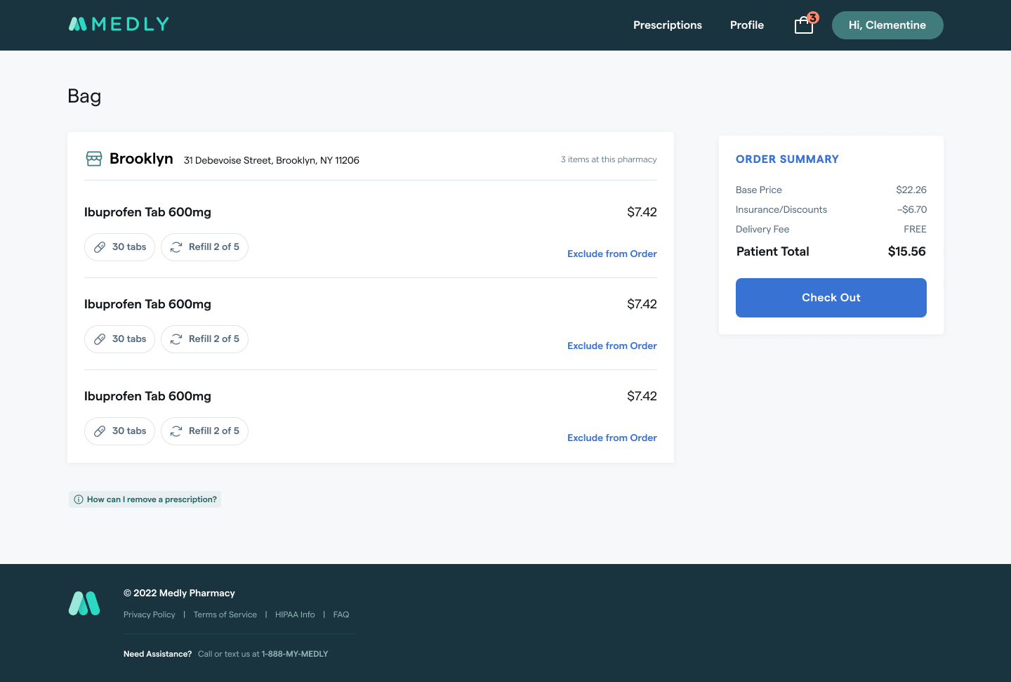
- What do you think "Exclude from Order" means?
- What do you think "Remove a Prescription" means?
- Do you like the bag being prefilled with your medications that are ready to be checked out or would you prefer to add them to the bag yourself?
Overall Impression, Expectations, & Analysis
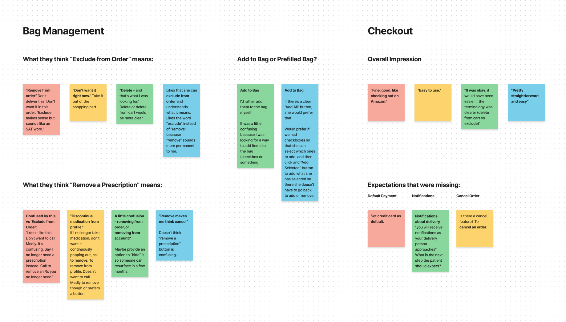
Overall Impression: Patients were able to navigate through the checkout process smoothly and understood how to go through the flow.
- “Good. Like checking out on Amazon.”
- “Pretty straightforward and easy.”
- “Easy to use.”
Expectations that were missing:
- Ability to set a payment method as a default.
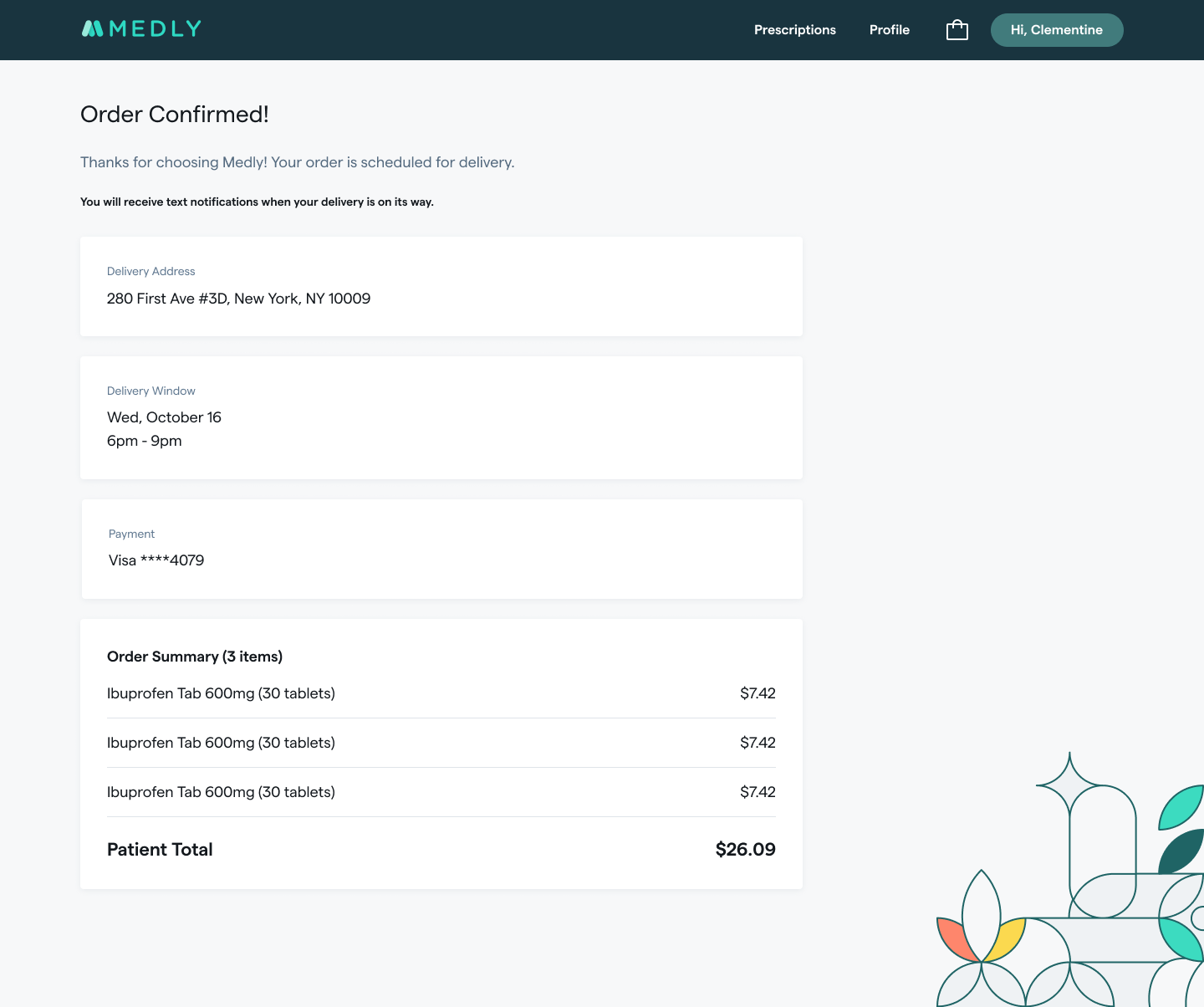
- Notifications about delivery. Patient expected a message on the order confirmation screen that he should expect texts/notifications as their delivery person approaches.
- Ability to cancel an order.
Bag Management Feedback:
- 'Exclude from Order’ terminology: Patients generally understood what exclude from order meant, but were confused when they saw the option to 'Remove a Prescription' button as well. Suggested terms: 'delete,' 'delete from cart,' or 'remove.'
- ‘How can I remove a prescription?’ button: There was some confusion about what this button was for and patients didn’t even notice it until it was pointed it out to them. They didn’t understand what the difference was between this and the ‘Exclude from Order’ CTA.
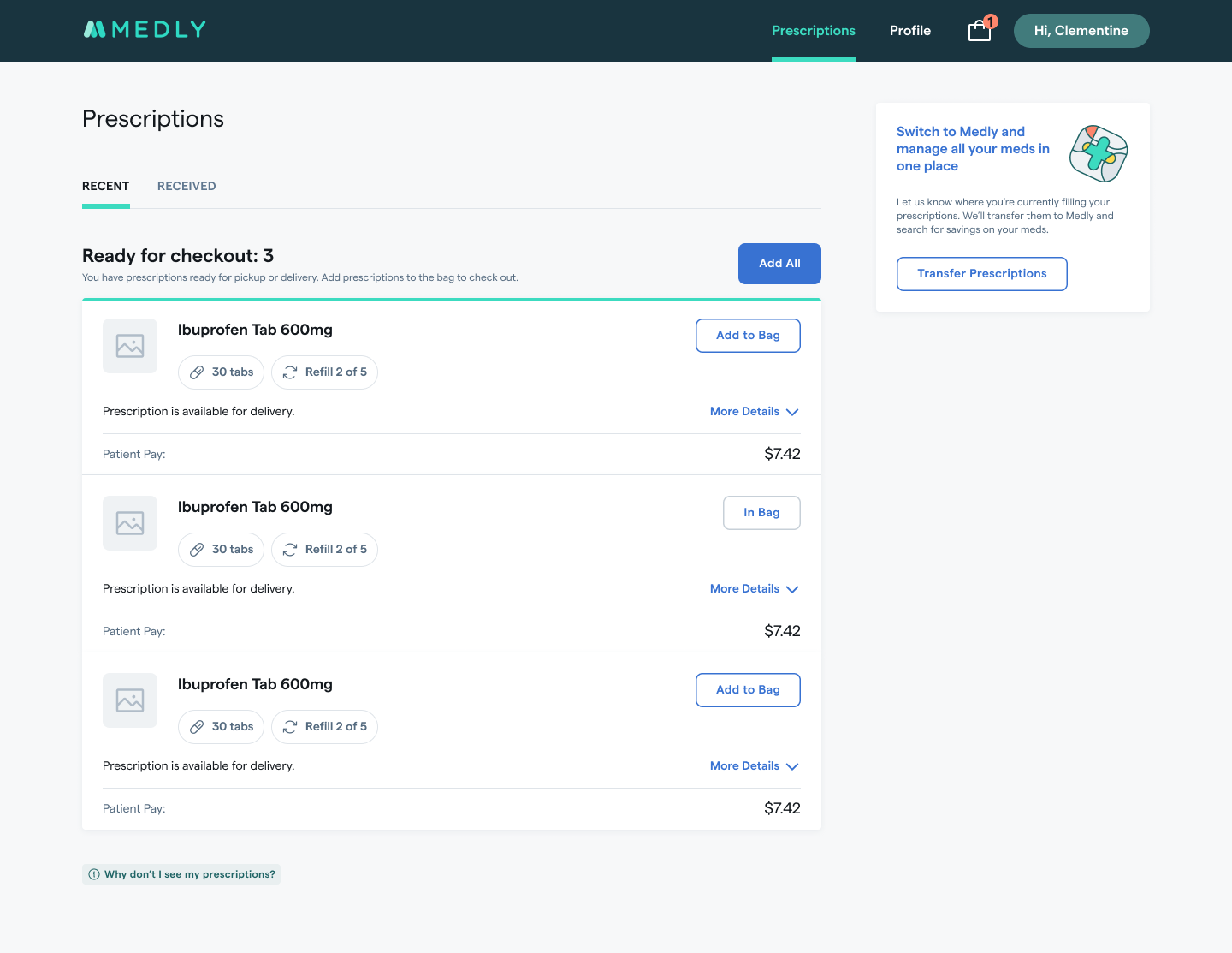
- Add to Bag or Pre-filled Bag?: The pre-filled bag in the prototype was confusing and patients were looking for a way to add the items to the bag. Almost all patients were looking for a way to edit their bag from the prescriptions screen and had to be directed to the bag page to see how they can remove.
Proposed Solution & Final Designs
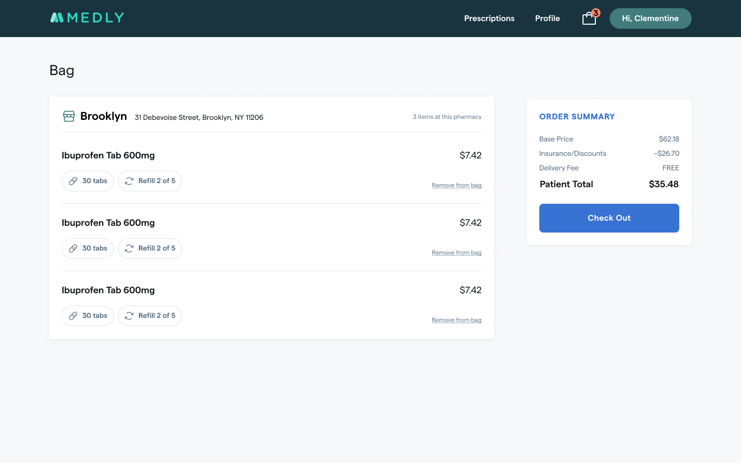
- Update ‘Exclude from Order’ terminology to ‘Remove from Bag’ so that it’s more clear that the patient is removing the prescription from their bag (or current order) and NOT their profile. The prescription will still exist in their prescriptions screen.
- Remove “How can I remove a prescription?” button to avoid confusion with ‘Remove from Bag’ CTA.
- This button currently only directs patients to call us in order to delete a prescription from their profile completely.
- Patients indicated that they want to avoid calling Medly to handle anything, if possible. We also already have a chat system and phone number listed in the footer for any help from Medly.
- We can consider reintroducing this into the product at a later time (with new terminology) when we can allow patients to hide or archive prescriptions on their own. Potential new language to use “No longer need this prescription?”
- Give patients ability to add/remove prescriptions to their bag themselves. This would give them the control that they’ve been wanting to choose what they want to check out.
Future Considerations
Desired Improvements to Checkout:
- Ability to reschedule: Two patients mentioned that they’d like to update their delivery details such as the delivery time, delivery address, form of payment, and delivery details.
- Ability to cancel an order: Patients want the flexibility to cancel an order. This is already a feature we were planning on.
- Setting payment method as a default: This might be a Square limitation, so this would have to be looked into. We do already save payment methods in their profile, so they don’t have to re-enter every time.
- Add messaging for delivery updates: There should be simple messaging on the confirmation page about texts/notifications they’ll receive for delivery updates.
- Option to leave deliveries at door: One patient mentioned that he wanted to at least have someone that’s he’s authorized/designated to accept his delivery with an ID, like his doorman.
Impact & Metrics
Time saved for agents: By full launch, roughly 65% of a patient experience agent's time was given back to assist with other issues outside of placing and scheduling orders.
Increase in scheduled deliveries per day:
- First location launch (New Jersey): 20-30 deliveries per day
- All locations: 250 deliveries per day
- We had weeks where we’d have over 1,000 prescriptions delivered
Many of our patients went to the pharmacy by foot, so we still wanted to accommodate for them. The new checkout experience made it a lot more convenient but also showed us how valuable the small brick and mortar experience was for a set of patients who liked having a face to face relationship with the pharmacist.
