Kalorian | Inventory Management
Gaming eCommerce
Kalorian is a safe & secure online marketplace where gamers can buy & sell in-game items. Below is the process of how I redesigned Kalorian's presentation of gaming items and reimagined the entire selling experience.
Goals & Objectives
- Create a more scalable inventory management system to accommodate for hundreds and thousands of gaming items across different games.
- Provide an efficient way for gamers to resell their gaming items and track them easily.
- Make it easy for gamers to bulk sell several items at a time.
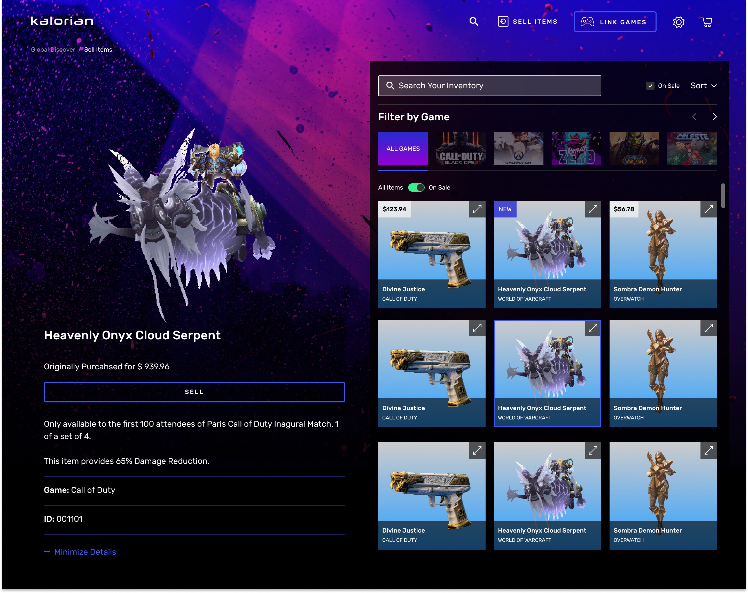
ORIGINAL DESIGN
Pain Points
- The original design didn’t accommodate for the hundreds of items a user could have and it was labor intrusive to have to constantly click on carousel arrows to scroll through only a few items at a time.
- There was also no easy or efficient way of reselling multiples of these items. Considering gamers can easily collect hundreds and even thousands of gaming items very quickly, even within just one game, this presentation was not very optimal.
- When we first launched, initial users voiced their frustrations with how they could only see 6 items at a time and had to constantly click the right arrows to reveal more items.
Role & Collaborations
- My Role: Sole Designer at the company
- Cross-Functional Partners:
- Product Manager
- Engineering Lead + Team
- Gamers
Breaking Down to Essential Steps
Approach
- Competitive Analysis: I did competitive analysis on other platforms where users have the ability to resell items to come up with the ideal user flow for organizing listings as opposed to items the user didn’t have listed for sell yet.
- User Feedback: When we first launched our beta, we kept an active conversation with our beta users through our Discord channel to receive feedback.
- Research of Actual Games: I researched how items were presented on actual games and how users typically go through their items.
Ideation & Proposed Solution
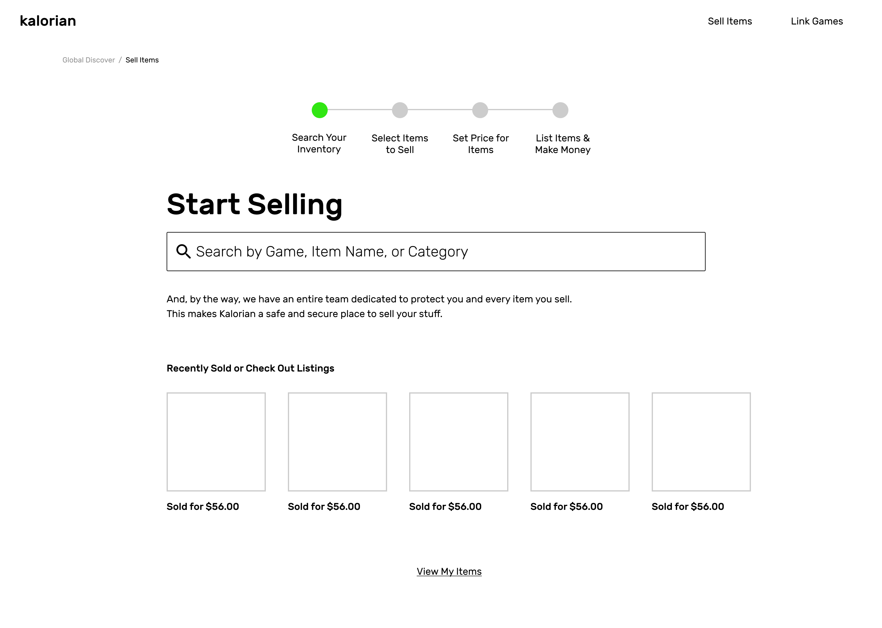
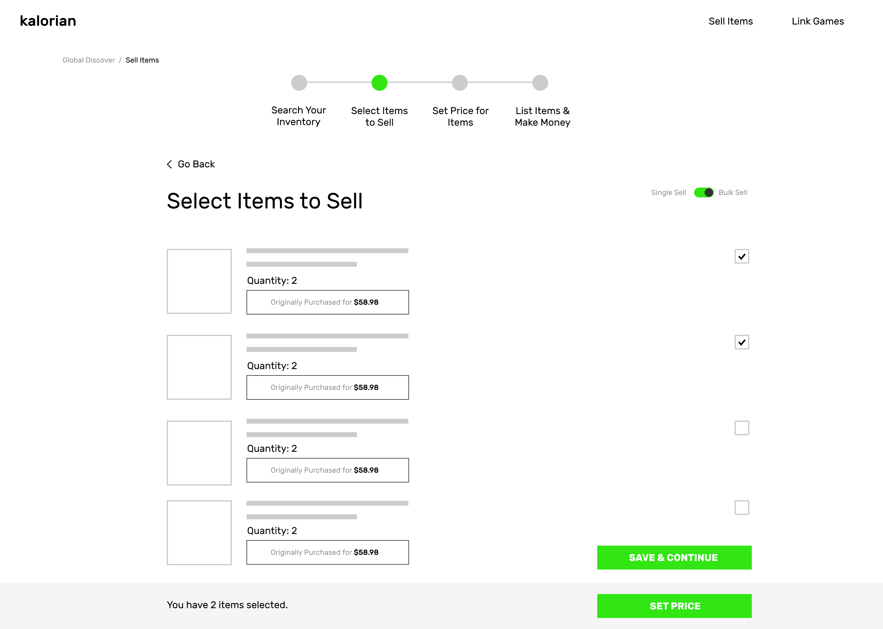
- We came to the conclusion of enabling a “selling” state so that the users can view their items if they want to, but once they were ready to start selling, they could enable that state and then start clicking on whatever items they wanted to and start listing prices for them.
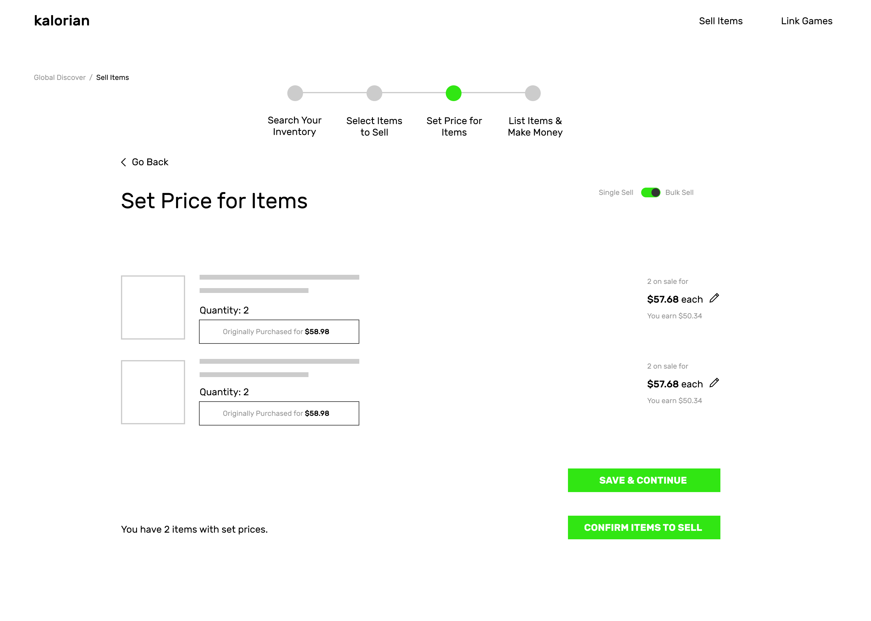
- Once the user selected all the items they wanted to sell, a white bar would slide up from below to let you know how many items you had selected. Once a user was done selecting, they could move forward to pricing all their items all at once. The original functionality could only let a user price and list one item at a time.
Early Design Iterations
Video Game Research Observations & Subsequent Decisions
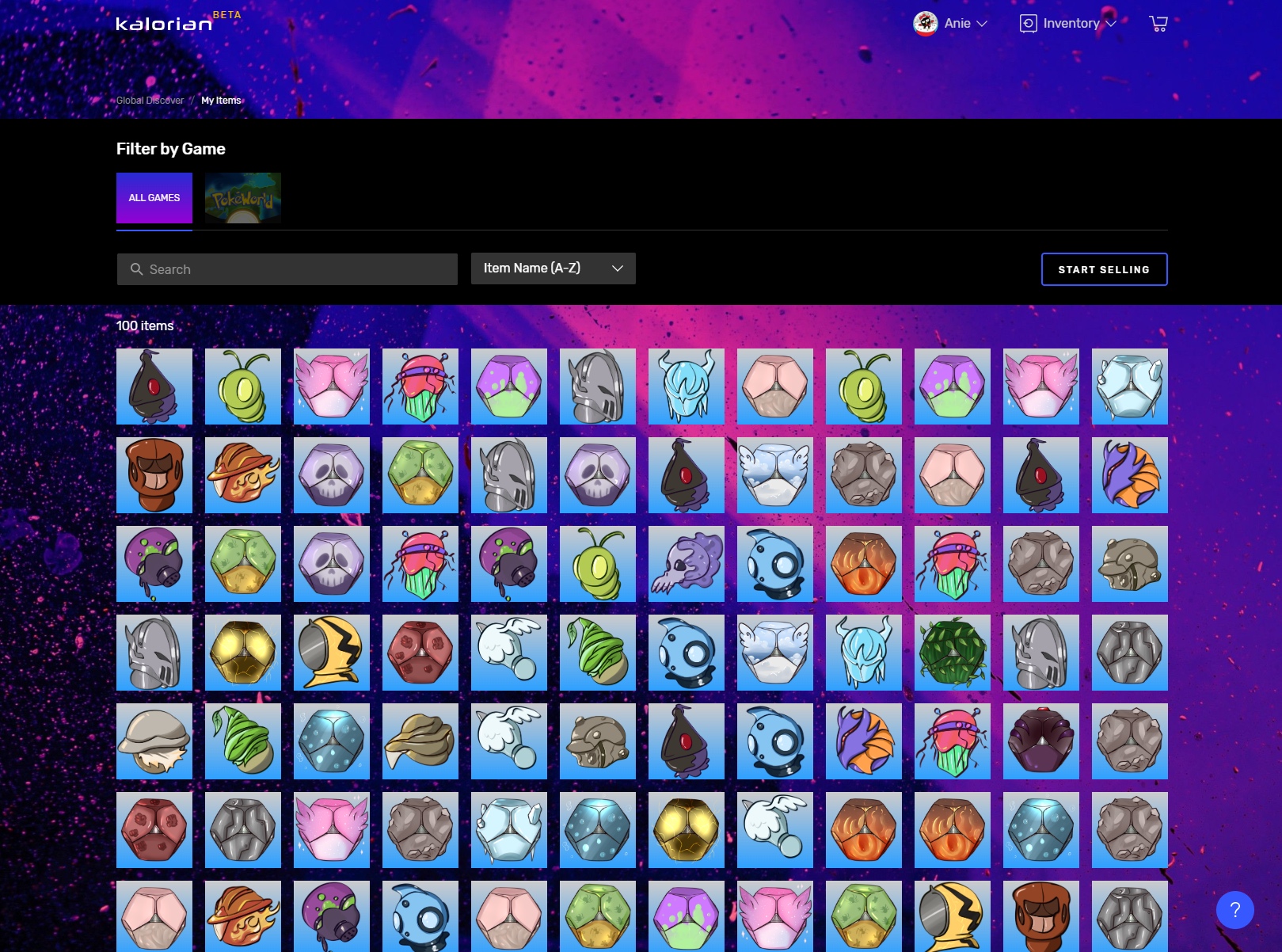
- Inventory in Actual Games: I researched how items were presented on actual games and how users typically go through their items. Inventory within games tend to be smaller in size because gamers can easily recognize the items they already own. We didn’t have to use large thumbnails and item names in this case because it would be a waste of real estate for a user that is already familiar with their own items.
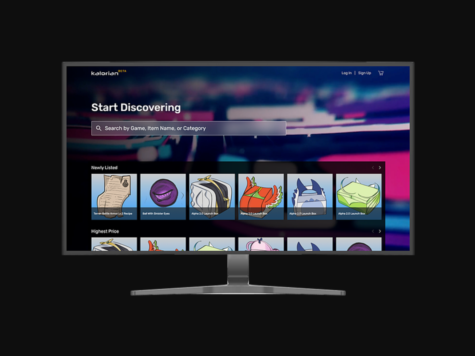
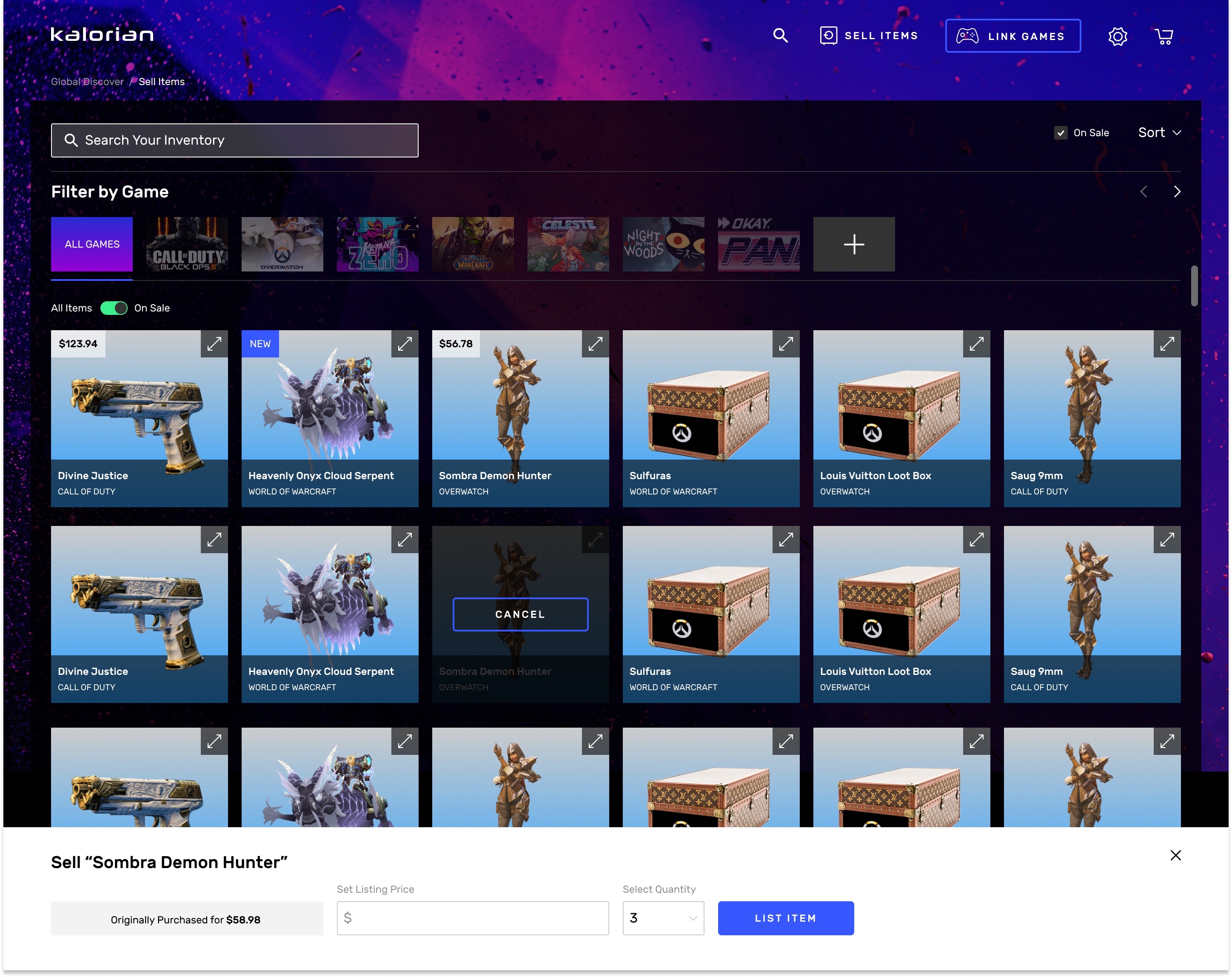
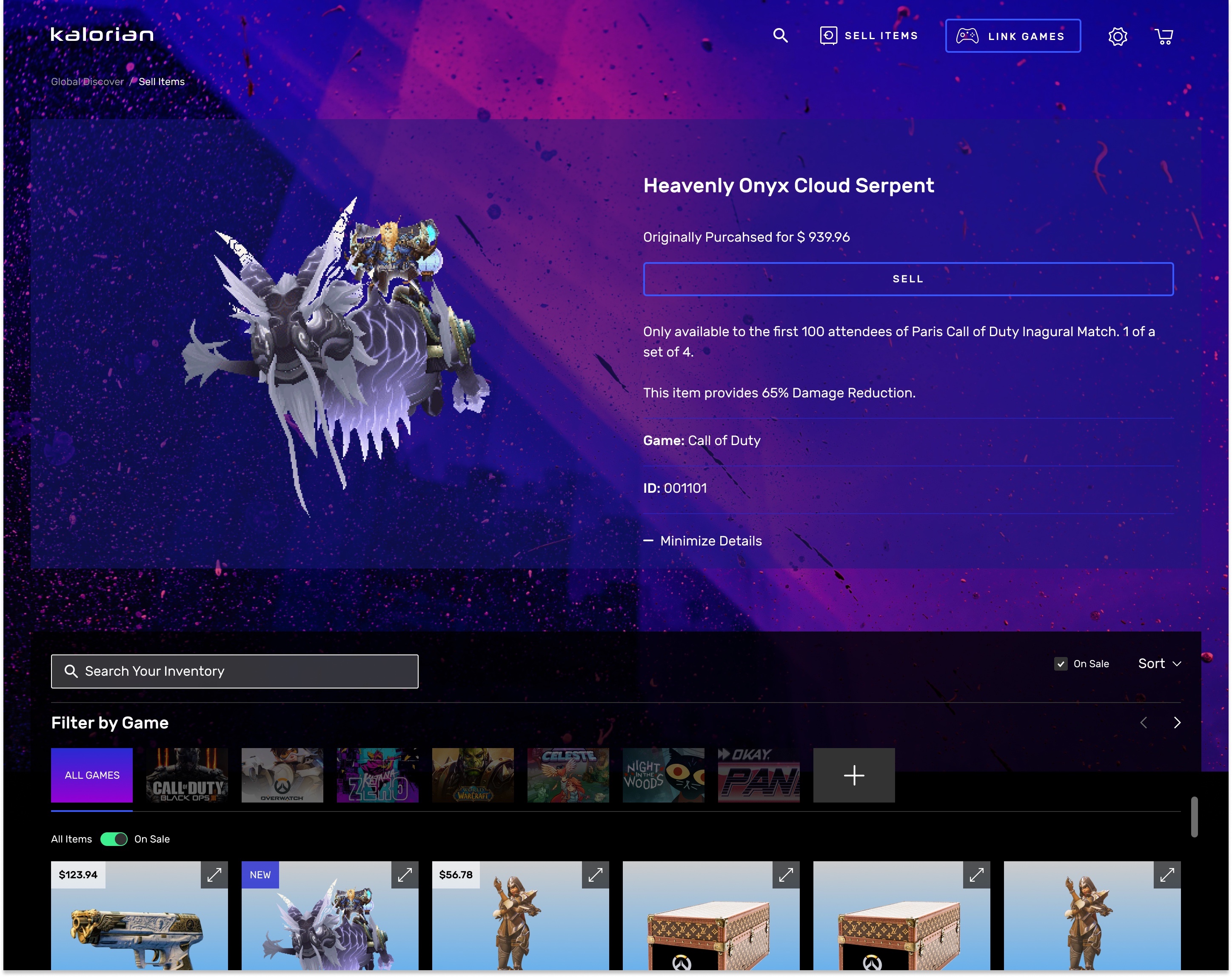
- Opt for Smaller Thumbnails: On the homepage of Kalorian, where any potential buyers are trying to discover new items, it makes sense to have larger thumbnails with the name of the item listed below the image. But for the inventory page, where we want users to easily go through their items and be able to easily select multiple items at once and bulk sell, I decided to try smaller thumbnails, revealing the item names only on hover. In case the user did want to see quick details about their items, we added the ability to click on the item to pop up a modal with a description. We also added the ability to filter your items by specific games at the very top, so again, we didn’t need to label the image thumbnails to better optimize the space of the items.
Gamer Impact from Final Designs
After the release of the new Kalorian inventory management system, gamers were very pleased with how much easier they could browse through hundreds of their gaming items, and be able to efficiently sell more than one item at a time.
We also built a separate listings page where they can reference which of their items are on sale and edit the prices if they wish to.
Because we launched shortly before the 2020 pandemic shutdown, we lost our funding and didn't get to see the evolution or long term impact of the product or this feature and how it would have affected the business.