Joy | Cash Gift Purchases
Gift Registry Tool

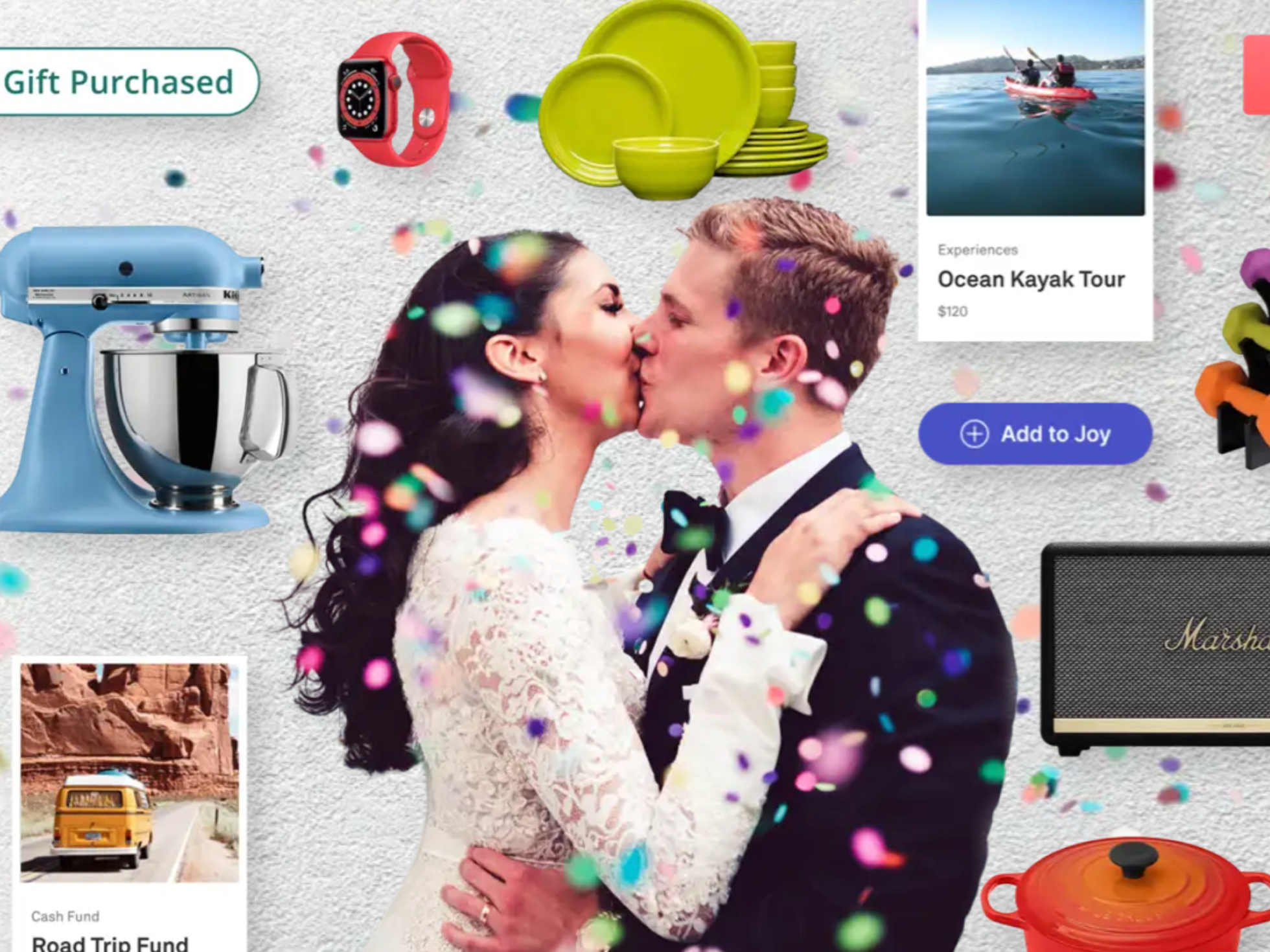
Joy is a wedding website builder and planning tool. The platform includes options to display and update event info, send digital invitations, manage guest lists, track RSVPs, and create gift registries. Below is a feature improvement to the guest purchasing journey specifically for cash gifts.
Goals & Objectives
The goal of this project was to streamline and fix the cash gift purchasing experience for guests and to mitigate their confusion. We also needed to give a clear status to couples when a cash gift had been reserved, purchased, or officially sent.
Pain Points
Through insights and feedback we received through our Intercom chat system and FullStory, we learned that both guests and couples were experiencing confusion and friction with the concept of reserving gifts and actually purchasing and sending/receiving them.
- Couples would get notified by email if a gift was reserved but didn’t understand why.
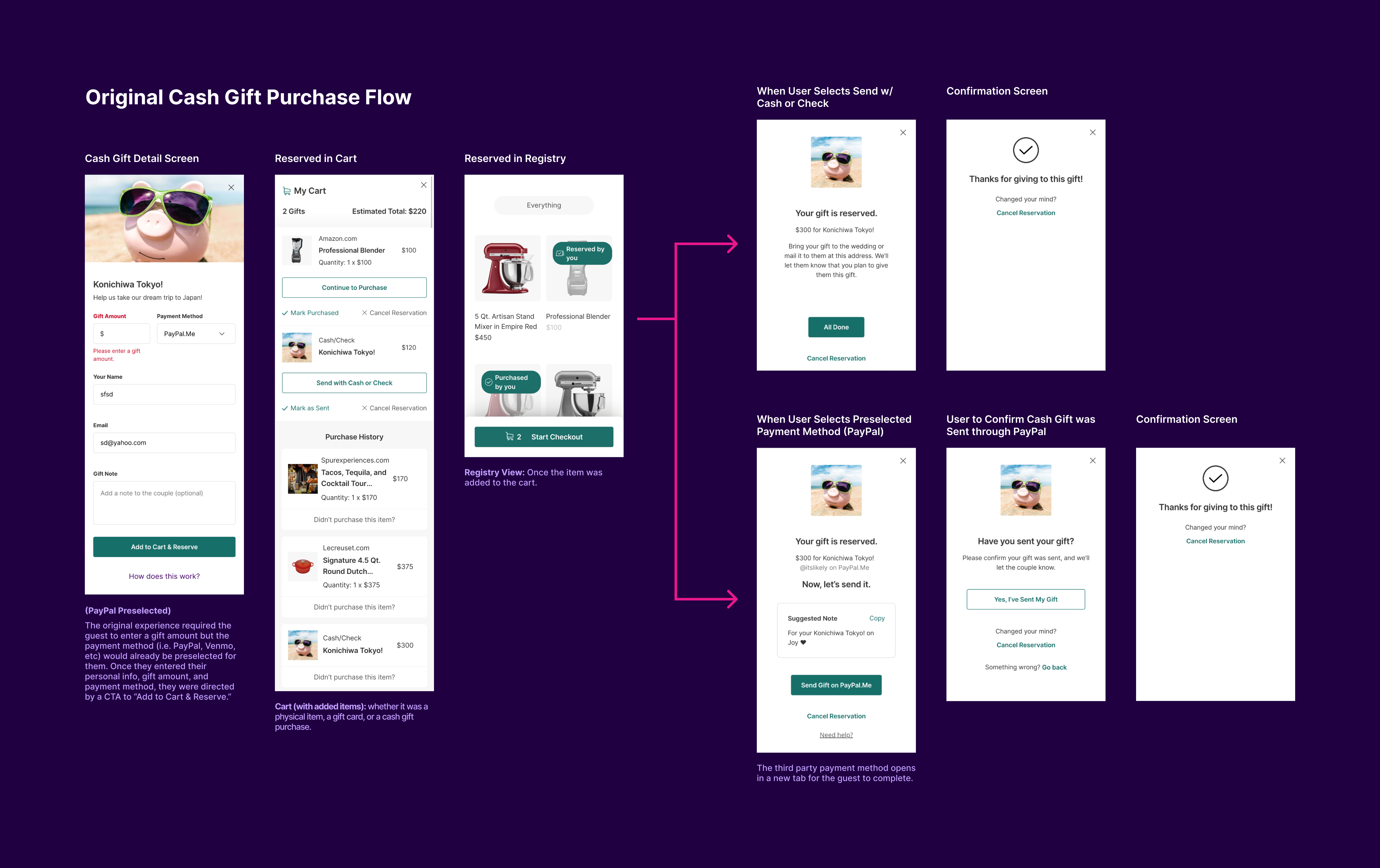
- Guests would press the “Add to Cart and Reserve” CTA but didn’t understand that they needed to finish purchasing the gift by manually marking it as purchased in the shopping cart after they linked off to external vendors.
- Guests were leaving reserved gifts in the shopping cart and couples were wondering why they hadn’t received them.
Cash Funds: Guests feel obligated to use payment vendors they aren’t familiar with.
- We were making it optional to use the easiest method of sending funds which was by cash or check.
- The original interface suggested a preselected payment method and made it difficult for the guest to use a method that they were already familiar with instead.
Our primary action for guests was to reserve gifts in the cart but they were kept in reserve indefinitely. We relied on sending email reminders to couples to nudge guests into finishing their purchase.
- Guests may want to “save” gifts by adding them to the cart, but this removes them from the gift pool indefinitely and they may never actually go forward and purchase the gift.
- Guests miss emails and sometimes don’t understand that they need to purchase the gift with the current reserve model.
- Guests had to understand that they needed to “cancel reservation” in order to return the gift to a pool.
- Guests had to work with the complexities of “marking as purchased” or “cancelling order” in order to move gifts around in the purchase journey.
- Couples were having to nudge guests for gifts that guests may not actually intend to buy, making for an awkward experience.
Role, Collaborations, & Timeline
- My Role: Lead Designer on the registry team. There were 6 total product designers in the company with 1 designer dedicated to a product area/pod. I took over and completed this project when I joined the company. Original insights were collected by a previous designer.
- Cross-Functional Partners:
- Product Manager: Synthesized feedback we had received directly through Intercom from couples or guests.
- Engineering Lead + Team
- Timeline: Project was completed over the course of 2 months including design, development, and testing.

Approach & Ideation
Allow guests to purchase gifts directly from the product detail page.
- A guest is free to either purchase a gift or add it to the cart and continue shopping.
- When a guest completes the purchase journey AND marks a gift as purchased we THEN contact the couple and let them know.
- Update the language from “Reserve” to “Add to Cart” or "Give Now" to add more urgency to the process.
Break out the journey into more steps that are focused for specific purposes.
Use a shopping cart model rather than a reserve model. This would remove a big point of friction in the checkout pocess.

Proposed Solution & Final Designs
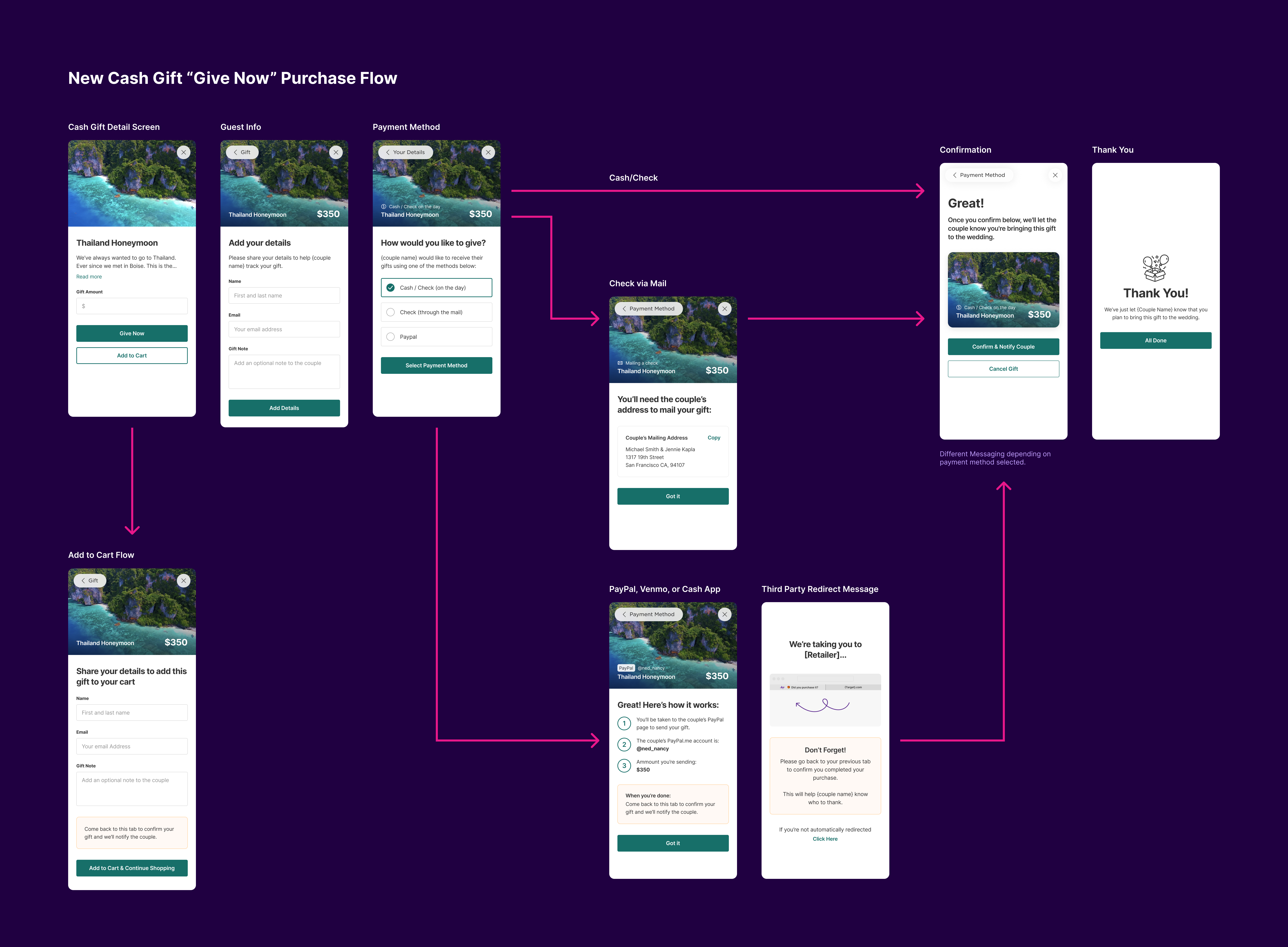
- Purchase journey was broken out into more steps that have a clear focus and intent for each screen.
- We collected the guest information in a unique step.
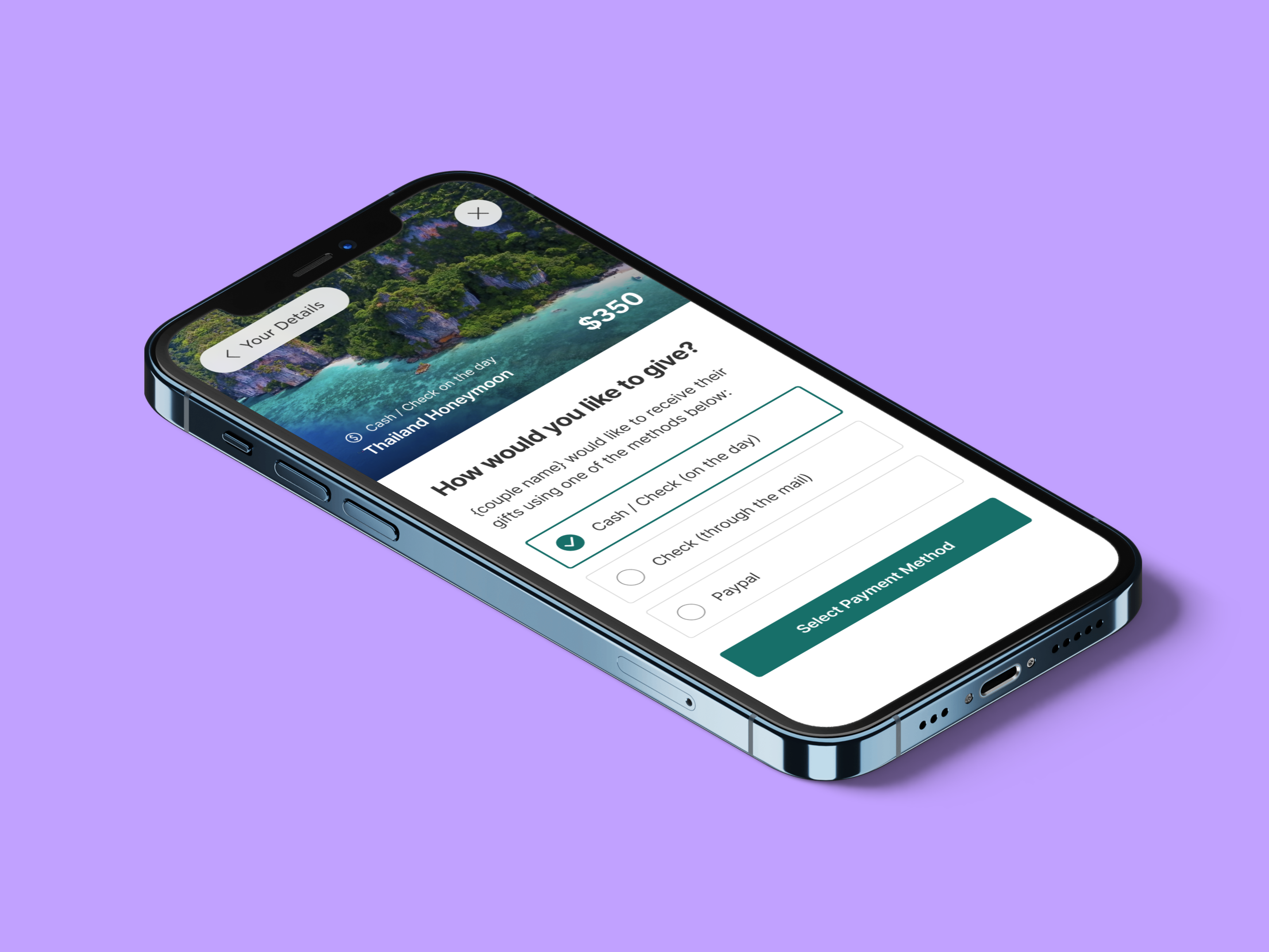
- We also allowed the user to decide how they want to send the funds and didn’t preselect any of the payment options for them.
- We provided tactical messaging for each screen.

Other Considerations
Guests were having similar issues with our affiliate product purchases.
- We applied similar updates to the affiliate purchasing journey by:
- Changing "Add to Cart & Reserve" CTA to "Buy Now."
- Split up the main product details screen from the guest's personal details for more clarity on what each screen is intended for.
- After guest enters personal details, they are routed directly to the next dialog box, and not the cart. Adding to cart happens in the background.
- Added screens for copying the couple's address, a redirect explanation, confirming the purchase, and saying thank you.
- Newly added screens for instructions and adding the order number so the couple can track.
Impact on Couples & Guests
Couples received gifts more successfully: Couples who originally expressed frustration were now showing gratitude for this feature improvement since the cash gift purchase experience for their guests became a lot smoother and clearer.
Our customer service reps shared that there was roughly a 75% decrease in feedback on purchasing confusion coming from couples/guests after this feature update.
