AT&T | Navigation Redesign
News Portal
The att.net site was a portal for AT&T's email users. The portal was meant to be a way for AT&T to further connect with their client base, by providing them engaging content from the many partners of AT&T. The portal was essentially a media aggregator of several highly authoritative content providers that cover many topics including CNN, USA Today, TIME, Newsweek, Bleacher Report, Sports Illustrated, Travel & Leisure, Harper’s Bazaar, and so on. This project objective was to redesign the desktop navigation of the AT&T portal product to increase engagement on verticals and boost article page views. The portal had 45 million+ users, with most being over the age of 50.
Goals & Objectives
- Increase traffic & engagement on verticals
- Increase article page views
- Help users easily discover content that was relevant to them
Pain Points
- Bounce Rate: Most users would check their email, read a few stories on the homepage, and then bounce.
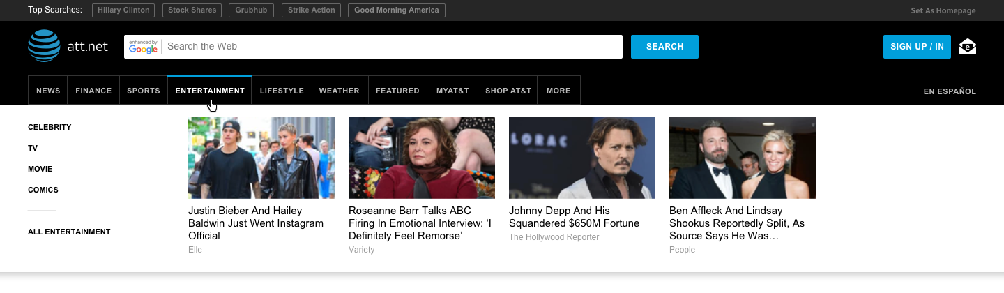
Cumbersome Navigation: Subcategories of verticals wouldn’t be displayed until a user clicked into one of the verticals. For example, a user would have to click on “Sports” first, wait for the page to reload, and then finally see the subcategories to navigate to NFL, NBA, Soccer, etc.
Role & Collaborations
- My Role: Lead UX Designer
- Cross-Functional Partners:
- Product Manager
- Clients: AT&T Product Marketing Managers
- Engineering Lead + Team
- A/B Testing Engineer
- Scrum Master
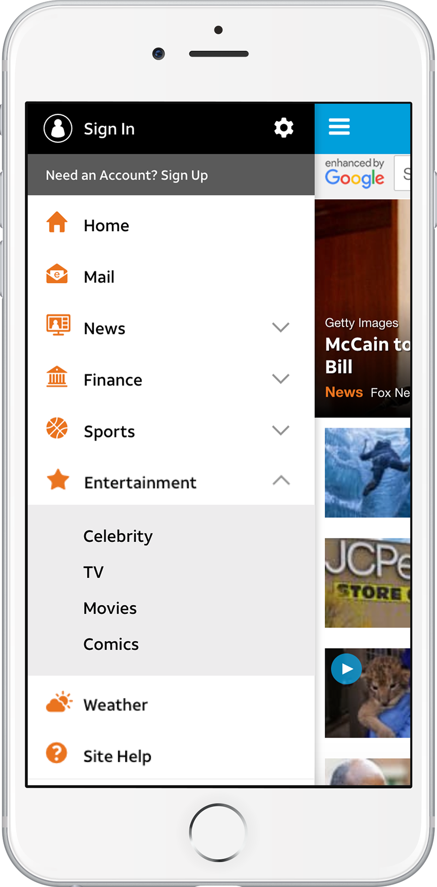
Inspired by Mobile Header & Menu Update
- Adding horizontal navigation to mobile helped increase engagement with other verticals so that users were digging deeper into the portal rather than staying only on the homepage or clicking straight into email.
- The launch of the new mobile navigation resulted in a 41% lift in vertical page views and a 13% increase in article page views.
- This success led to an interest in a horizontal navigation for the desktop experience to encourage users to visit our verticals.
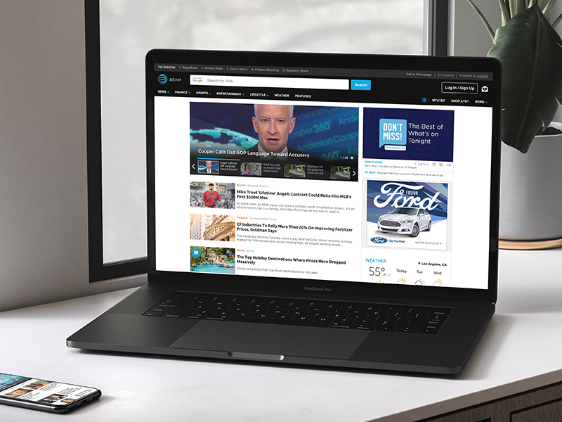
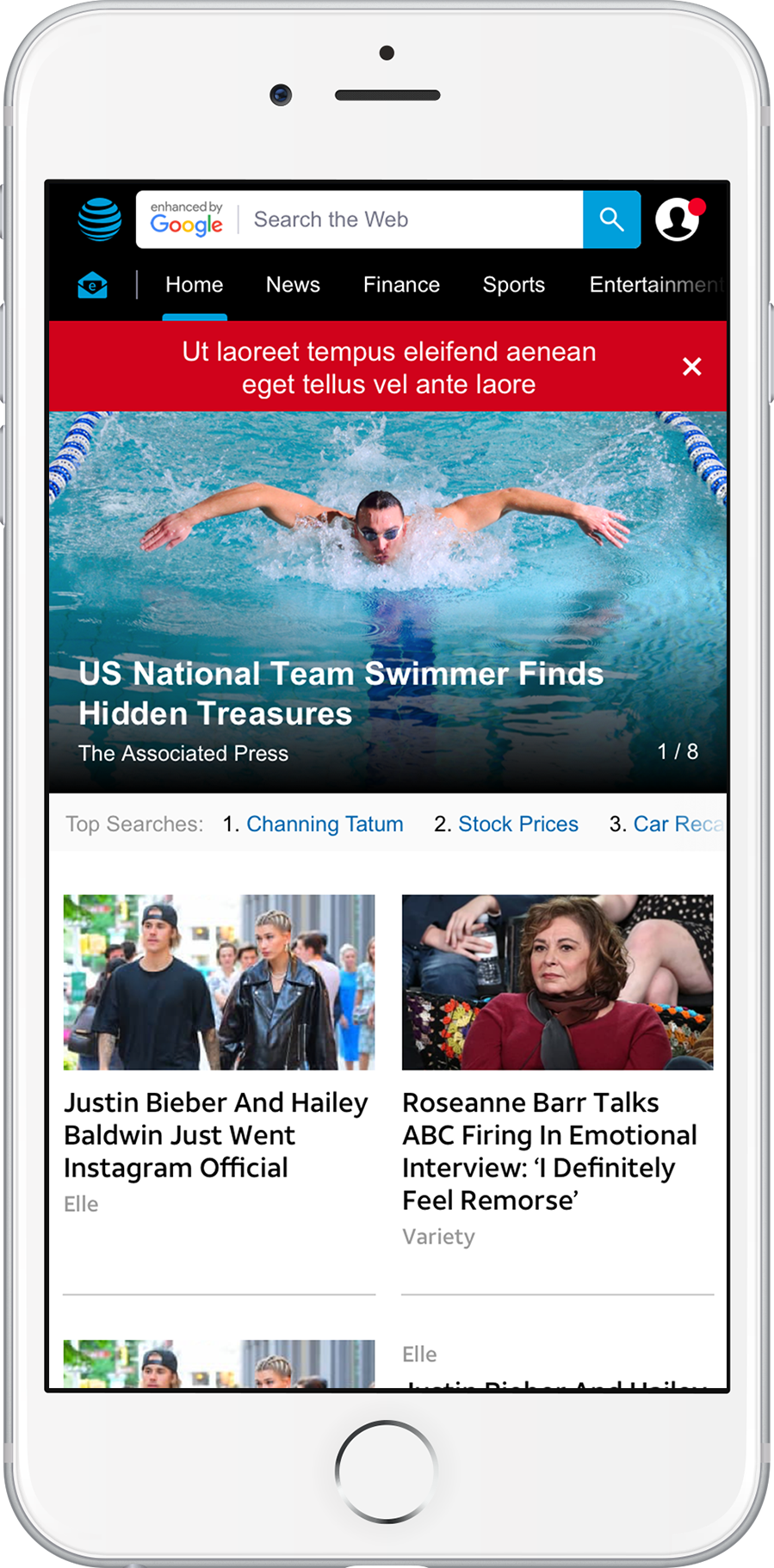
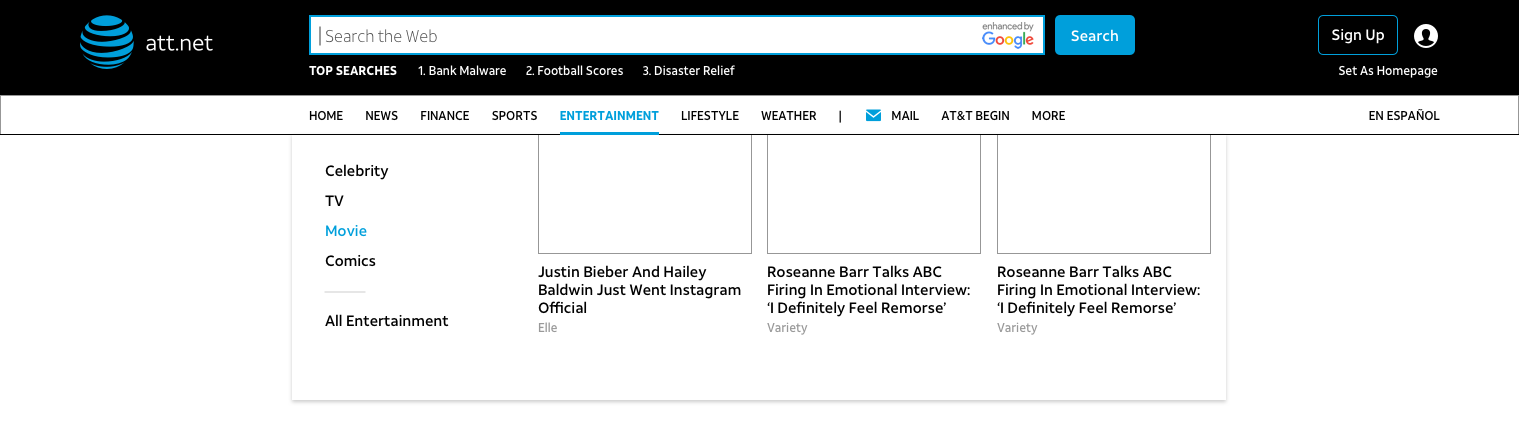
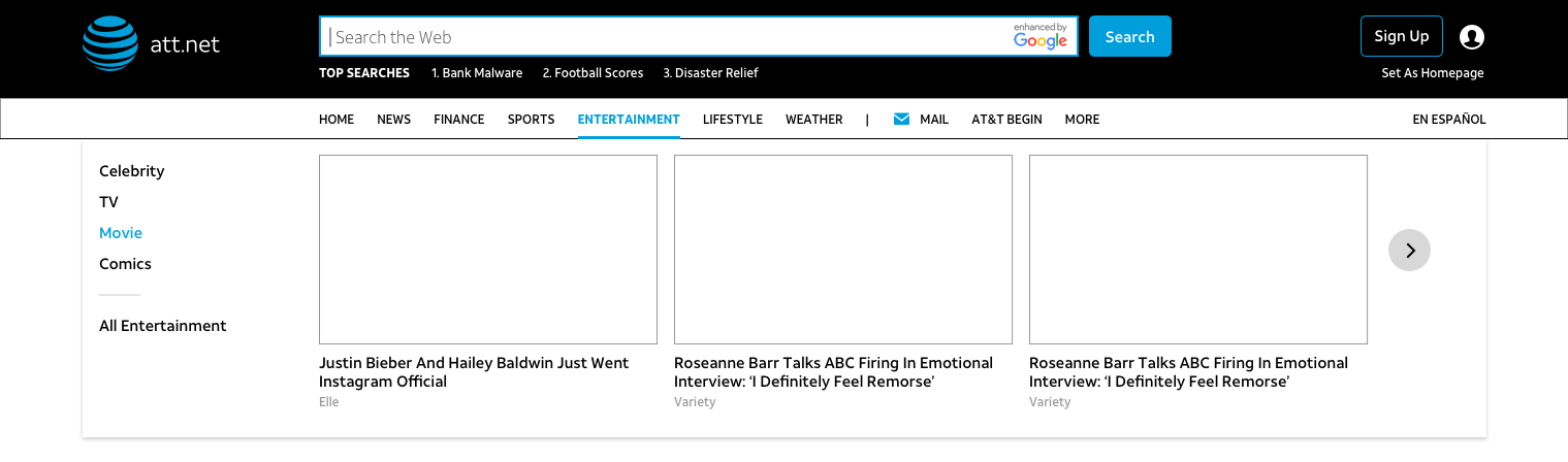
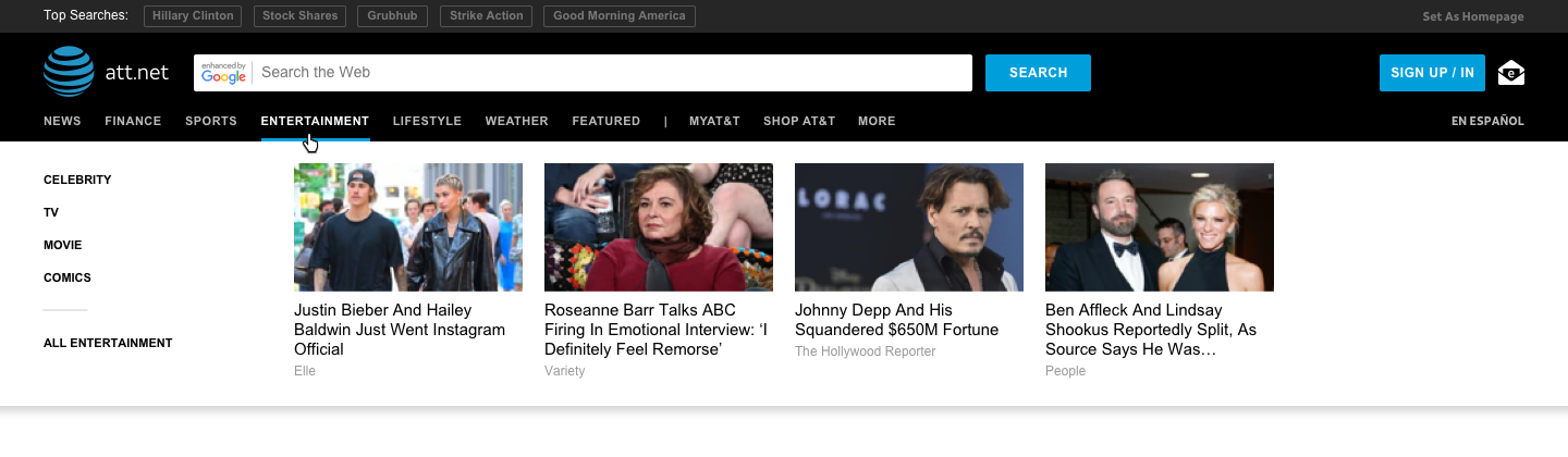
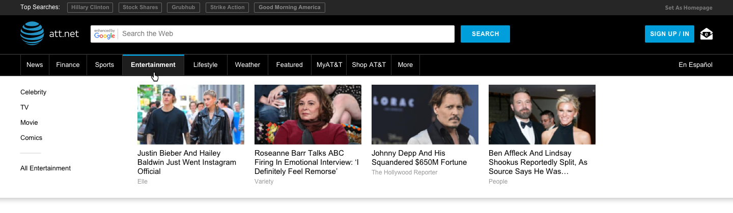
OLD NAV
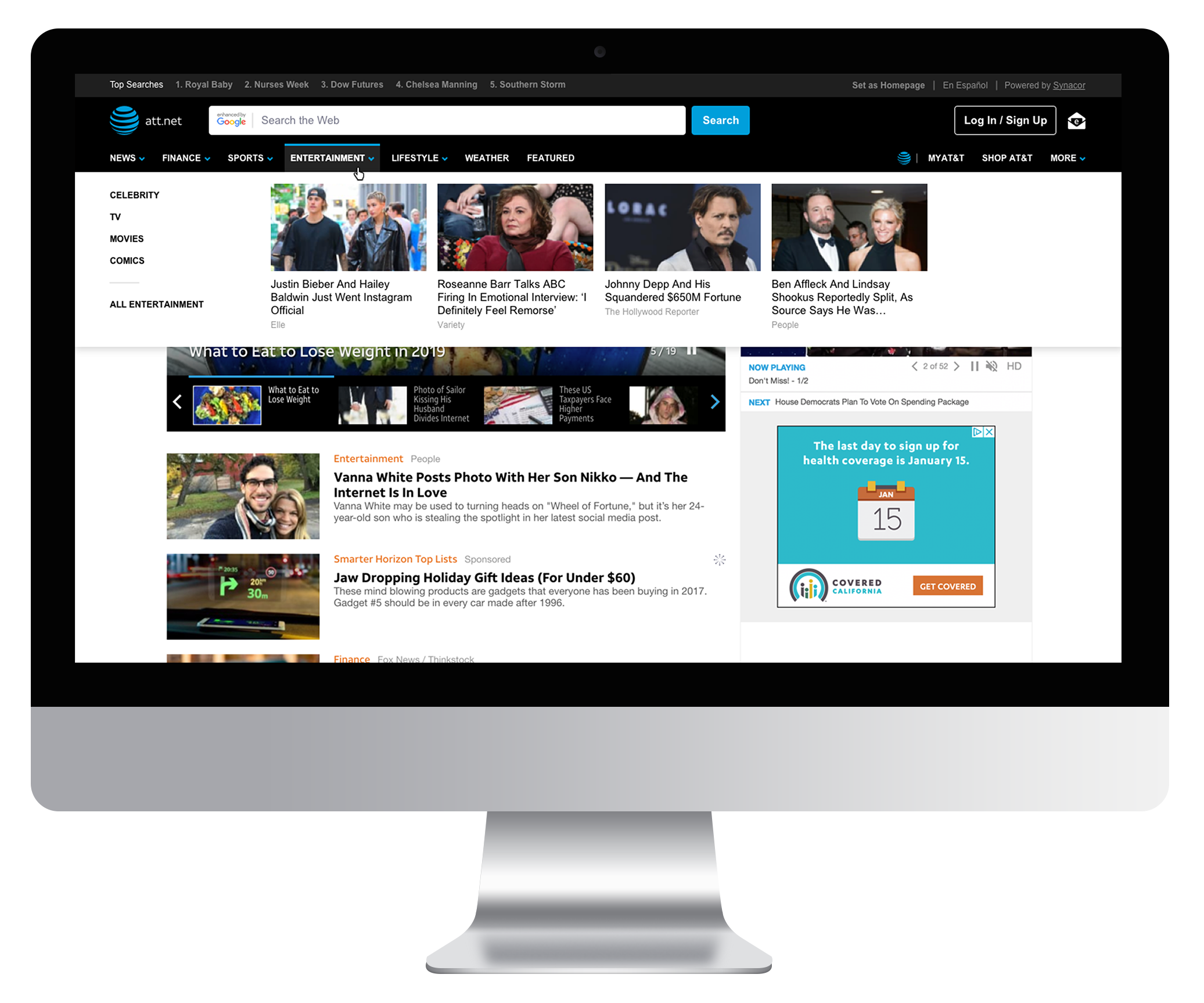
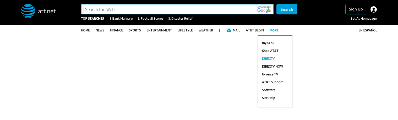
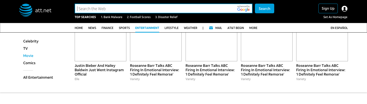
NEW HEADER + NAV
NEW PROFILE MENU

Research Methods
- Performance Metrics: We knew based on these metrics that most users weren’t engaging with the verticals.
- Stakeholder Interviews: Discussions with AT&T helped us to prioritize what was important to meet the business goals and plan for future implementations as well.
- User Surveys from AT&T: Users did complain through AT&T surveys that the navigation was difficult to use.
- Competitive Analysis: Looking across media websites helped inspire how I approached our navigation system.
Ideation/Exploration
- Competitive Analysis: After competitive analysis with other news sites, including the new Yahoo site, we noticed almost all sites used a horizontal navigation system.
- Planning for Redesign: Other benefits that we were striving for when moving to a horizontal navigation were an increase in page real estate, a better balance of white space versus content, and more layout opportunities for when we were ready for an overall redesign.
- Navigation Best Practices: I explored different ways to organize the content and tried to reduce the amount of navigation items. I researched best navigation practices and found that there shouldn't be more than 7-9 items to avoid overwhelming the user with too many options or making it too difficult to find what they’re looking for.
- Compromising with Client: AT&T had a hard time prioritizing what navigation items to consolidate. I had to work with them to bring focus to the main verticals and reduce the AT&T links that didn’t live on the portal into a dropdown.

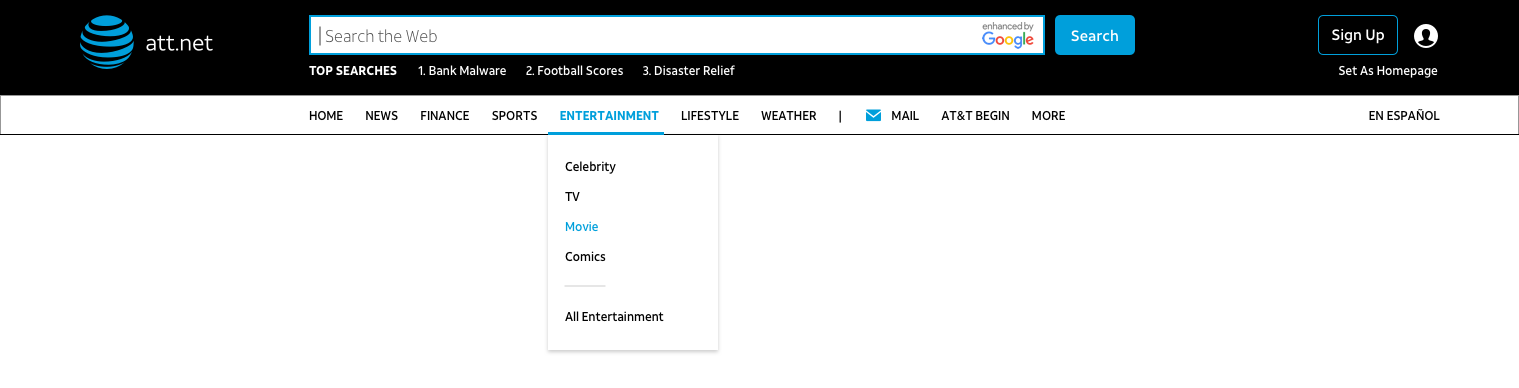
Taking Dropdown Further
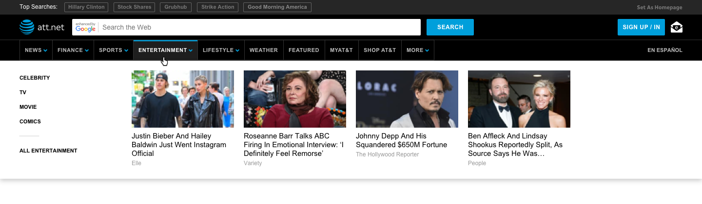
The purpose of this horizontal move, other than getting more flexibility with the layout of the page, was to also increase engagement to other verticals. Rather than doing simple dropdowns of subcategories below each main category, I started to look into inserting content cards from those specific categories as a way for a user to preview content under that section. If a user were to hover over these categories, they could see what type of content they would expect to see and possibly be more inclined to navigate to that section.
Technical Discussions
- Feasibility: During the wireframing phase, I went over the concepts with engineering and explained the expected functionality and behavior before presenting it to my client to make sure I was aware of the engineering effort it would take for the options I was presenting and if there were any technical feasibility concerns.
- A/B Testing: We had an engineer dedicated to A/B testing, so I consulted with him to see if we can test with actual content in the dropdown that was already curated by our editors directly from the top story carousels that we had at the top of each of the vertical pages. We tested with 10% of our user base.
A/B Testing
- We used Adobe Test & Target for our A/B testing needs for this project.
- For the first round of testing with our user base, people didn’t seem to be hovering enough to notice the content cards in the dropdown and we didn’t get a very high increase in traffic to verticals. The difference was minimal.
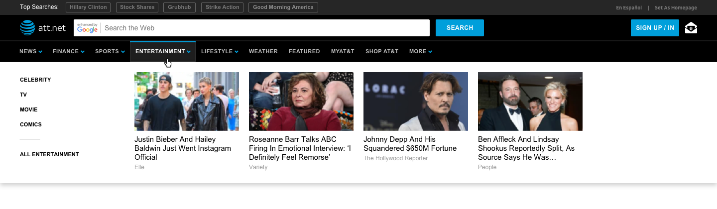
- We did a second round of testing with new changes that included adding tabs to make the nav items feel more like buttons, uppercase text versus title case text, and the addition of arrows.
- In the end, the arrows and uppercase text proved to increase the amount of clicks into the dropdown by 25%.
A/B Testing Round 1

A/B Testing Round 2
Usability Testing
- We also were interested in getting qualitative information from our users, considering what a large effort and change this navigation would be, so we used UserTesting.com to gain this feedback.
- The demographic of our user base skewed older, with a majority of our desktop users being 50+ years old, so we made sure to test with that audience.
- An overwhelming amount of our testers preferred the horizontal navigation over the original vertical one.
- They also appreciated the content cards within the dropdown to guide them to more content that was similar to what they were seeing in the dropdown.
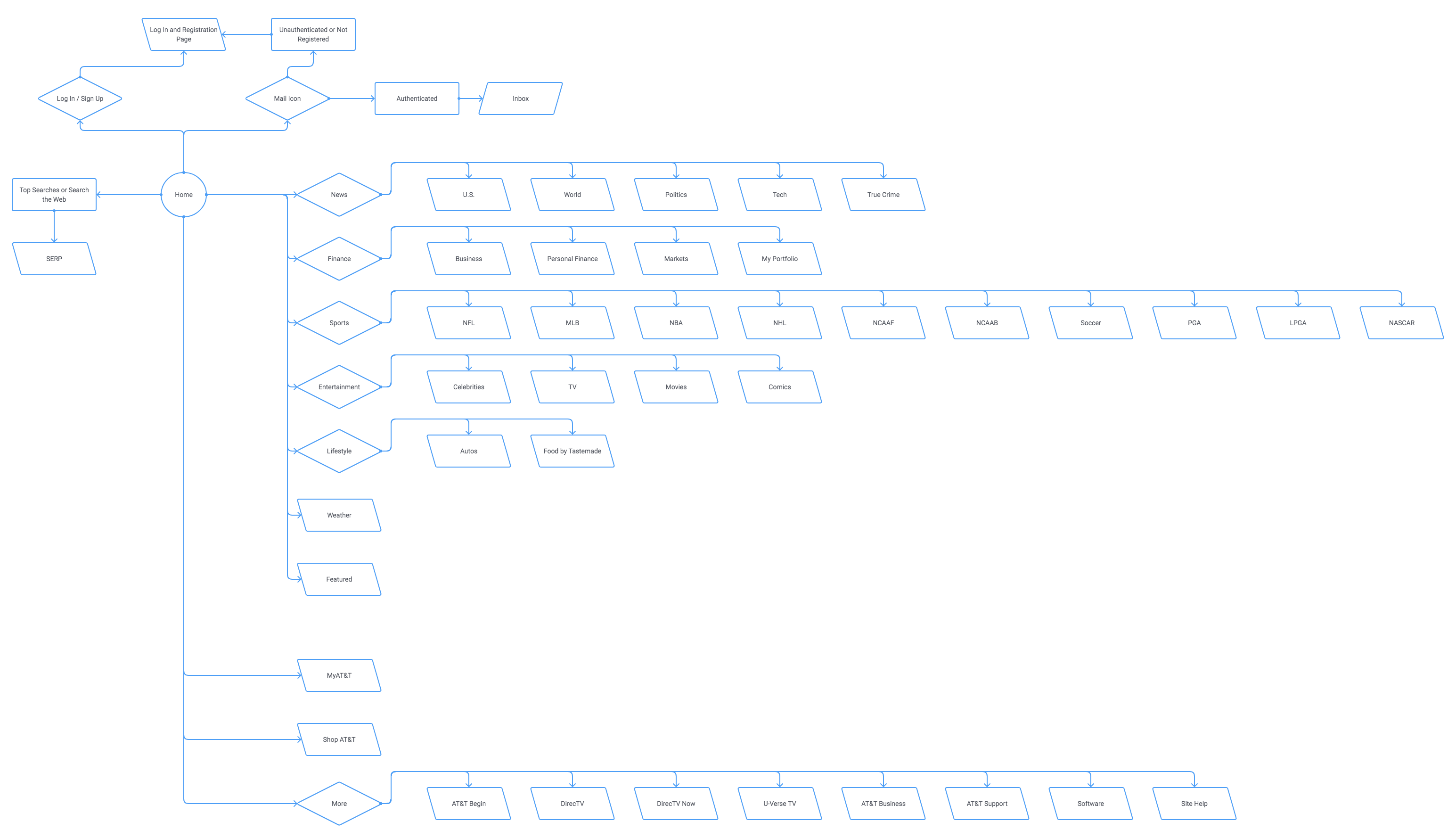
User Flow
Final Design & Impact
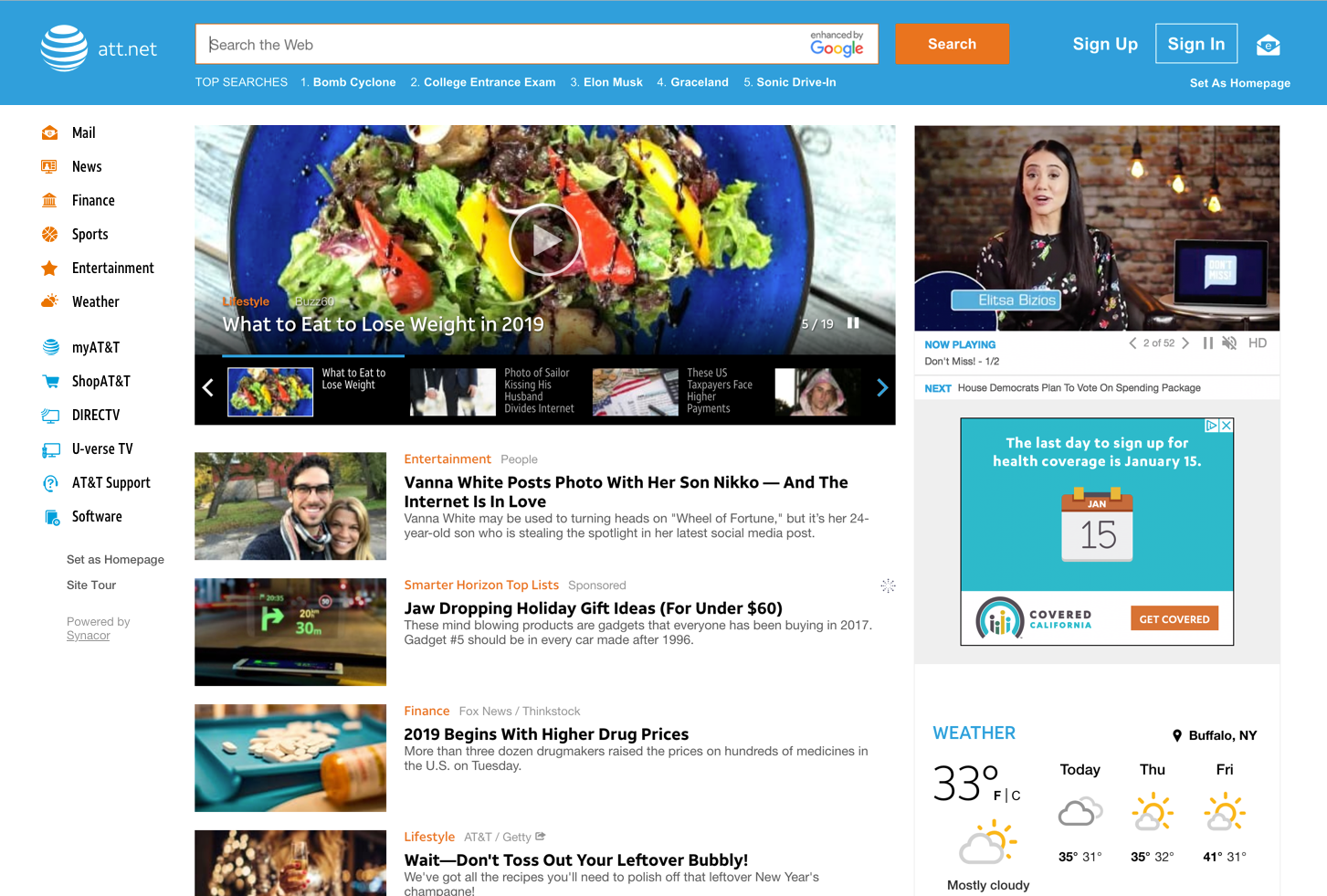
After several rounds and versions of designs, we landed on the version that separated our content navigation area from the AT&T properties area. A few of our users pointed out that they thought it was much clearer when anything that had to with AT&T account information or other AT&T properties was separated into its own section and wasn’t combined with the rest of the main navigation. This also helped the issue of having too many navigation items. It was difficult for AT&T to minimize the amount of navigation items, but the separating of sections proved to be a successful compromise.